New Work: Bariatric Fusion brand refresh supplements focus with flavor.
With its strong community following, Bariatric Fusion needed a brand refresh that resonated with medical professionals and patients. The design had to be serious enough for clinicians while remaining empathetic and flavor-forward. It had to acknowledge the emotional complexity of the bariatric journey while recognizing flavor’s importance for long-term compliance.
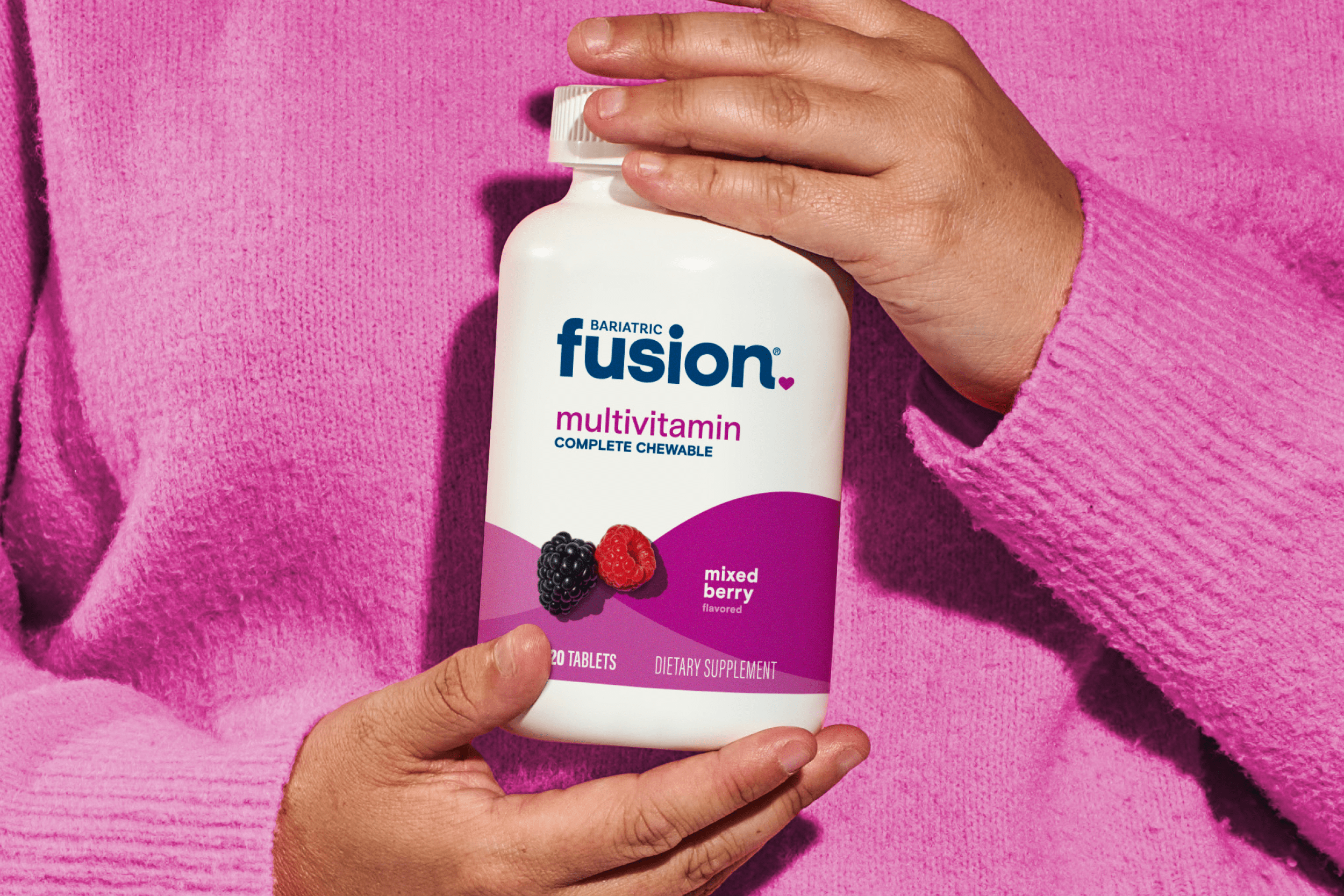
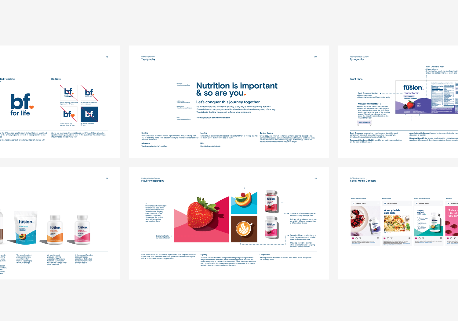
Both sensory experience and efficacy are crucial for this demographic, creating a unique design challenge that requires balancing seemingly opposite elements. White minimalistic design signals clinical effectiveness and trustworthiness, while bold imagery and vibrant colors communicate taste appeal and sensory satisfaction. The solution? Iconic, clean flavor cues with a delightful color palette give the BF line a confectionary feel that promises enjoyable consumption, while white and navy elements maintain medicinal credibility and reinforce the products’ serious health benefits. This careful balance ensures consumers don’t feel they’re sacrificing either pleasure or effectiveness when choosing Bariatric Fusion products.
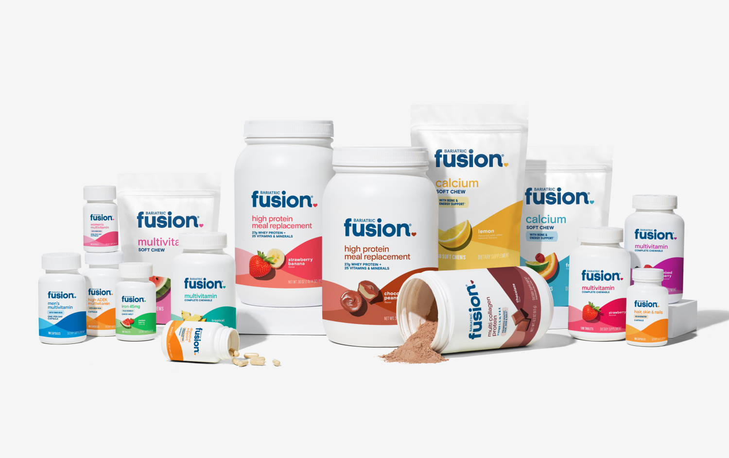
The comprehensive brand strategy developed an intuitive, flexible system to communicate complex information across multiple product forms without overwhelming consumers or diluting the brand identity. Through extensive consumer insights and market research, we positioned Bariatric Fusion as a supportive partner throughout the customer’s health journey, rather than just another supplement provider. This positioning is visually reinforced by incorporating heart cues and colorful wave shapes to symbolize vitality and optimism, creating emotional connections beyond mere functionality. The communication approach maintains a tone that is both genuine and aspirational, acknowledging challenges while focusing on empowerment and positive outcomes. This dual approach resonates particularly well with consumers seeking both emotional support and evidence-based solutions during significant health transitions.

The need for adapting to flavor trends and innovation was essential for Bariatric Fusion, leading them to develop a nimble, flavor-forward design system that relied on simple ingredient cues at the center of their visual identity. This strategic approach enabled the brand to communicate product benefits clearly while maintaining visual consistency across their diverse product range. Rather than creating rigid, overly specific templates, the BF team implemented a “big picture” design system that provides both flexibility and cohesion, allowing them to quickly respond to market demands and consumer preferences. This adaptable framework has proven invaluable as the company continues to expand into new flavors, delivery forms, and functional benefits, ensuring that while product offerings evolve, the core brand identity remains recognizable and strong. The ingredient-centric design elements serve as intuitive visual shortcuts for consumers while giving the marketing team the creative freedom needed to highlight unique product attributes without sacrificing brand consistency.
Refreshing this supplement brand has led to significant positive outcomes across multiple stakeholders in the bariatric healthcare ecosystem. Clinicians have shown increased interest in recommending Bariatric Fusion products to their patients, recognizing the brand’s commitment to both scientific efficacy and patient experience. The strategic redesign has established a clear path toward category leadership by differentiating Bariatric Fusion from competitors through its unique blend of clinical credibility and consumer appeal. Perhaps most importantly, the refresh has strengthened the sense of community among the brand and patients during all phases of their bariatric journey, from pre-surgical preparation through long-term maintenance.
This enhanced connection has translated into improved patient compliance with supplement regimens and greater brand loyalty, as users feel genuinely understood and supported by packaging and messaging that acknowledges both their practical needs and emotional experiences. The revitalized visual identity has also opened doors to new retail partnerships and expanded distribution channels, allowing the brand to reach more patients who can benefit from their specialized nutritional solutions. To view more images of the brand refresh and see these principles in action across various product lines and touchpoints, click here or head to our work page to explore the full case study alongside other successful brand transformations.