New Work: Pure Formulas Packaging Refresh Creates Modern, Intuitive System
Pure Formulas, a leading e-commerce supplement retailer, needed a packaging refresh across the private label line. With a vast and growing product portfolio, the brand required a flexible and future-proof design system to better communicate quality, simplify navigation for consumers, and enable innovation into new categories like beauty and nutrition.
Leaning on white labels and an overly stripped-down aesthetic, the existing Pure Formulas packaging lacked differentiation in an increasingly competitive market and failed to convey quality. Additionally, no intuitive organizational system connected the wide range of supplements and limited expansion into new categories like skincare and nutrition.
Freshmade conducted discovery sessions with Pure Formulas stakeholders, conducted thorough competitive, category, and category-adjacent analysis (both in DTC and retail) and underwent social listening to prioritize benefit communication and inform communication hierarchies on-pack. This cross-functional collaboration uncovered pain points while also charting ambitions for the brand’s identity and consumer experience.
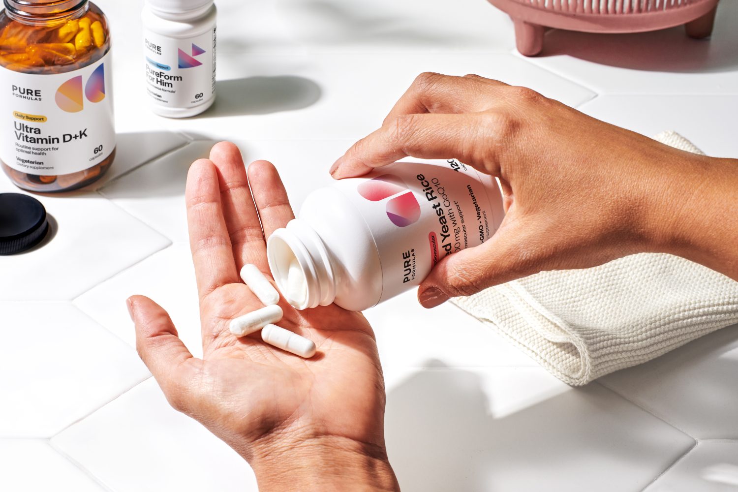
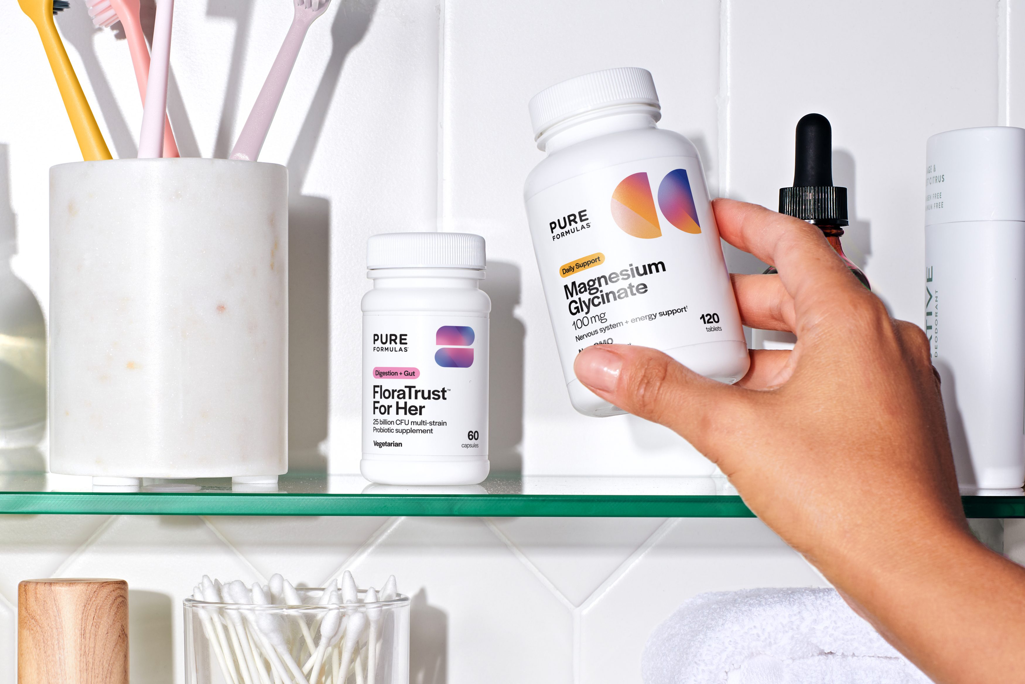
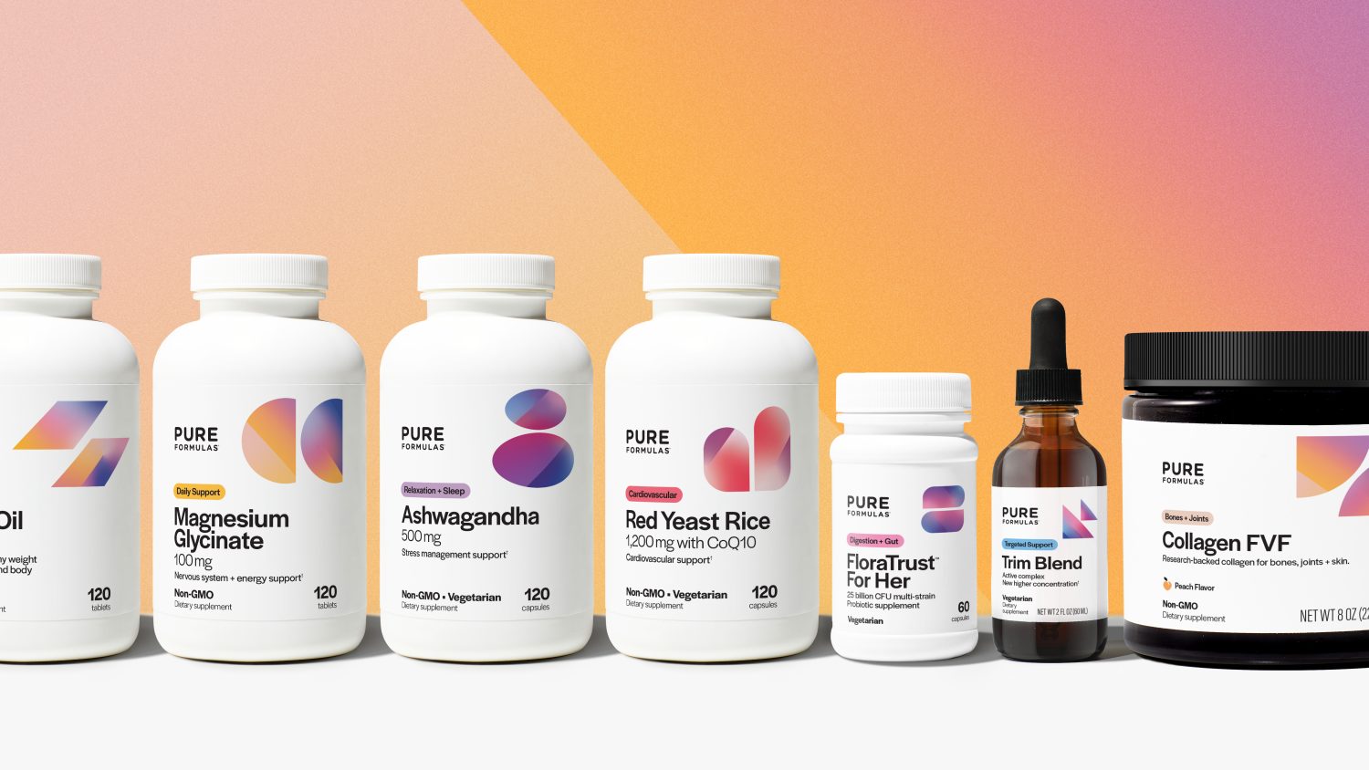
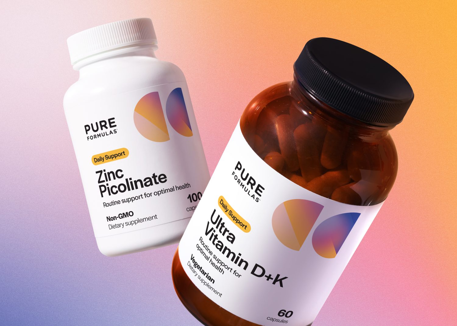
Armed with insights, Freshmade conceived an adaptive packaging design ecosystem using a custom icon system to organize and denote segmentation and key benefits. Vibrant icons in unique shapes guide consumers to the right products for their needs whether heart health, skin care, or nutrition. A distinctive gradient within the primary graphic communicates energy and vitality, and unifies the family of icons.
Ultimately, Freshmade’s packaging redesign helped evolving DTC brand Pure Formulas streamline its private label supplement portfolio while establishing a future-ready identity system to support expansion into new consumer health and wellness segments.