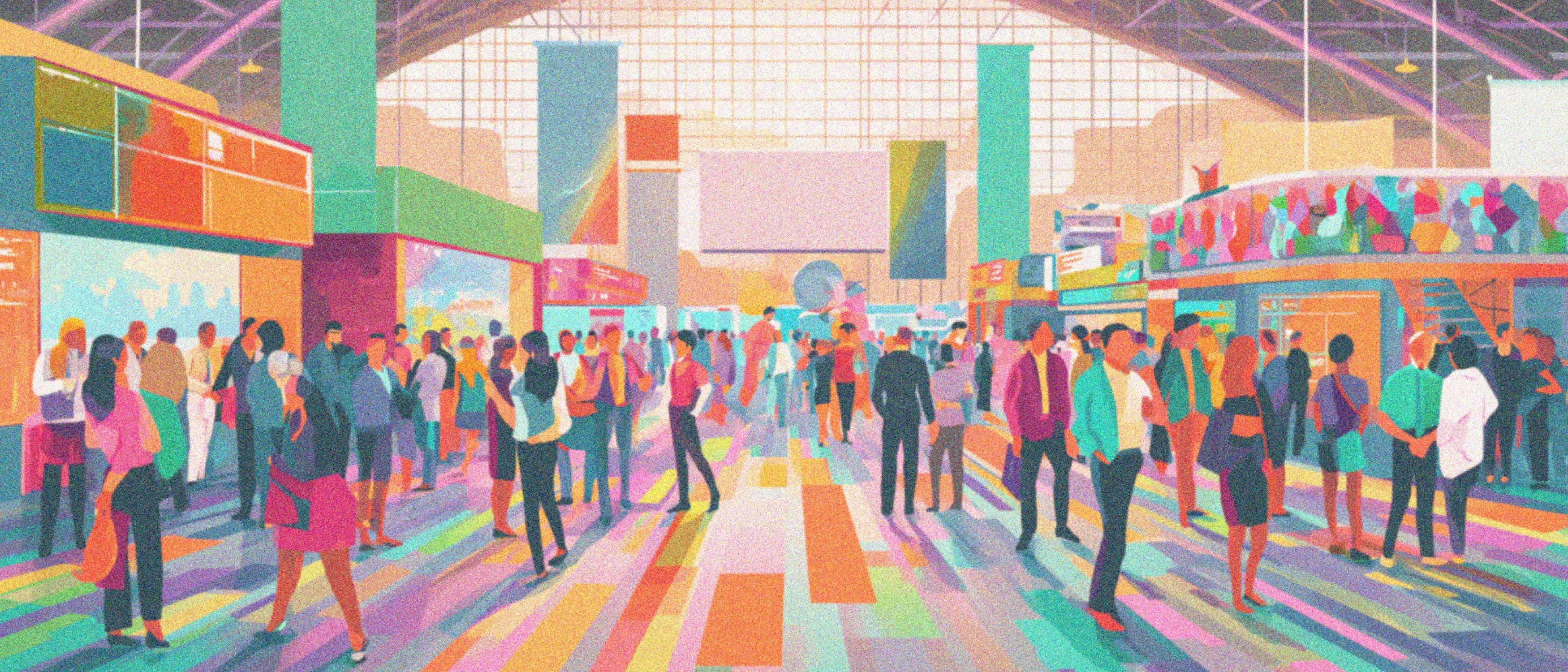
Tradeshows represent one of the most concentrated brand-building opportunities in the B2B calendar. In a single day, your brand can be seen, experienced, and remembered by hundreds of buyers, retail partners, distributors, and press … or it can fade into the background noise of a crowded convention floor.
The difference, more often than not, comes down to booth design. Nay, booth “experience.”
A boring or disorganized booth can feel like a trade show within a trade show — too many moments that never add up to one. What prevents that isn’t more signage; it’s the details most booths miss: messaging at eye level where conversations actually happen, lighting that makes the footprint feel distinct from the aisle outside it, an entry that pulls people in, and a floor plan clear enough that a buyer who came for one product ends up in front of another before they realize they’ve moved.
Whether it’s custom or modular, your booth should feel like it was always meant to tell your story. Here’s what that actually looks like in practice.
Put Your Branding Where Conversations Happen
The hanging banner is essential, and we’ll get to it. But let’s start at eye level, because that’s where your brand story actually gets read.
When an attendee walks into your booth and starts talking to your team, they’re absorbing everything in their immediate field of vision roughly three to six feet off the ground. Counter graphics, panel messaging, product signage, framed brand statements: all of it registers in the context of that conversation.
If your key message only lives on a 10-foot overhead graphic, it’s not doing work in the moment that matters. Messaging overhead gets you found. Messaging at eye level gets you remembered. Intentional eye-level branding turns your booth into a layered brand experience rather than a structure with a logo on it.
Design the Threshold Between Open and Closed
Here’s one of the most common and costly mistakes in booth design: erring too far toward either open or closed.
A booth that’s overly enclosed — high walls, a counter that blocks entry — creates an implicit message: this space is for people who already know they want to be here. Passersby don’t feel invited. They skirt the edges and move on.
A completely open booth has the opposite problem. Without a defined perimeter or sense of arrival, there’s nowhere to be. Nothing to enter. People move through rather than stopping.
The goal is a booth that creates a felt sense of place without creating friction to get there. Lighting that makes your footprint feel distinct from the aisle outside it. Flooring that signals you’ve arrived somewhere. Furniture arranged to create a natural entry point. Partial structures that frame the experience without walling it off. And a floor plan intentional enough that a buyer who came for one product ends up discovering another before they’ve even thought about leaving.
When attendees feel like they’re entering a space rather than wandering near one, dwell time increases. And dwell time is everything.
Your Team Attire Should Be Swag, Not Just a Shirt
Although most often don’t think of it this way, team attire is actually a design decision.
The standard move is cohesive branded apparel: matching colors, maybe a logo. That’s fine. But the brands that really turn heads think bigger. Think about how effective mascots are at drawing attention and creating memory on a show floor. Think about what direct-to-print technology has made possible at nearly any budget. There is really no excuse to not have genuinely creative, high-quality custom apparel that’s as intentional as the booth itself.
Your team attire is a walking billboard, a crowd signal, a first impression, and a conversation starter all at once. It tells the room that this brand has a point of view. It makes your people findable from across a packed hall. And it gives buyers a reason to smile before they’ve even tried the product. Retailers are at expos to discover great brands, and a little costume energy, done with confidence, is one of the fastest ways to become the booth everyone is still talking about at dinner.
Plan for Storage Like Your Booth Depends on It (Because It Does)
This is the least glamorous insight on this list and possibly the most impactful.
Your team will be at this booth for eight hours. They have bags, jackets, water bottles, phone chargers, extra collateral, personal snacks, and a dozen other items that need somewhere to live. If you haven’t built storage into your booth, those items will occupy every available surface within the first hour. That carefully designed (and expensive!) brand experience you’ve created becomes a visible mess.
Storage needs to be integrated from the design phase: enclosed cabinetry, under-counter space, a curtained rear zone. Whatever form it takes, it needs to be in the plan from day one. Definitely not solved on setup morning with a folding table and a curtain rod.
Multiple Display Areas Enable Multiple Conversations
Consider what happens with a single product display table: your team can have one productive conversation at a time. When two or three people gather, the next person to approach sees a crowd and moves on.
Multiple product display areas spread across the booth footprint, each with its own lighting, signage, and presentation, change the math entirely. Two team members can each be mid-conversation simultaneously. Traffic flows rather than piling up. The booth looks active and accessible rather than occupied and exclusive.
There’s also a floor plan benefit: when displays are positioned intentionally, buyers move through the space in a way that exposes them to more of the line. A buyer who came for one SKU ends up in front of another before they realize they’ve moved. That’s not accidental; it’s designed.
Be Findable Before You’re Approachable
Everything listed above happens within the booth. This one happens 50 feet away.
Hanging banners and elevated signage aren’t just for branding; they’re better thought of as wayfinding tools. Convention halls are large, crowded, and overwhelming. Attendees moving through the floor are often scanning for specific brands or categories from a distance. If your name and visual identity aren’t visible from across the hall, you’re invisible to everyone who would have come to you if they’d known where to find you.
Vertical presence from flags, hanging structures, and elevated graphic elements is the first layer of the tradeshow experience. It’s what brings people to your booth before your booth gets the chance to work on them. It shouldn’t be an afterthought or a budget cut.
The Bigger Picture
None of these details exist in isolation. They work together as a system. You are creating a space that can be found, entered, inhabited, and remembered. This is also a massive undertaking; think about the hours, money, and team effort that go into one tradeshow. It’s EPIC. Your booth should be too.
Freshmade is a brand strategy and design studio specializing in food and CPG. We help emerging and established brands show up with intention — at tradeshows, on shelf, and everywhere in between. Vanessa Doll, EVP at Freshmade, is a lead strategist with 19 years of experience in CPG branding.