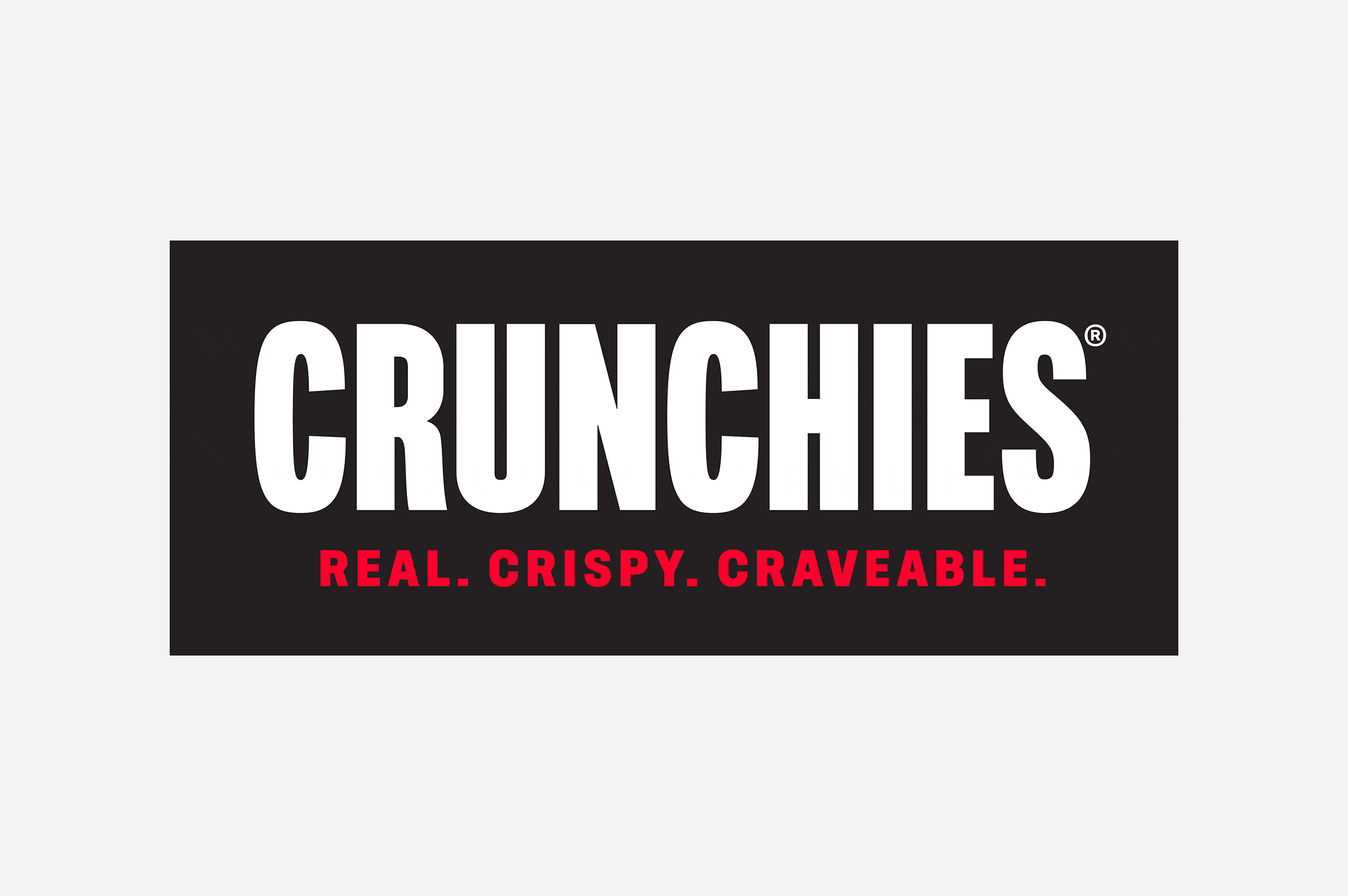
Crunchies.
Brand refresh.
CPG Brand Strategy. Visual Identity. Package Design. Brand Narrative. Site Design. Motion. Product Photography.
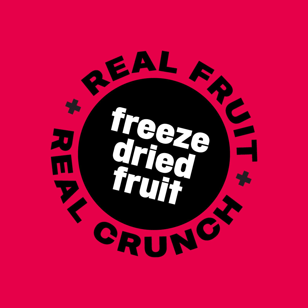
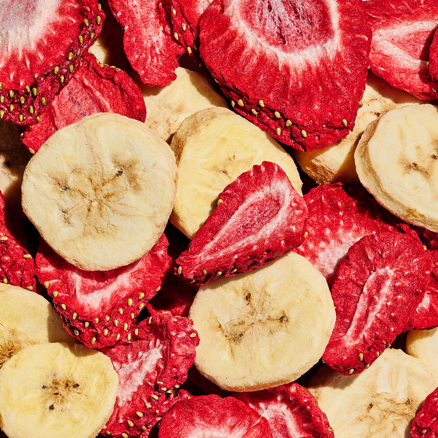
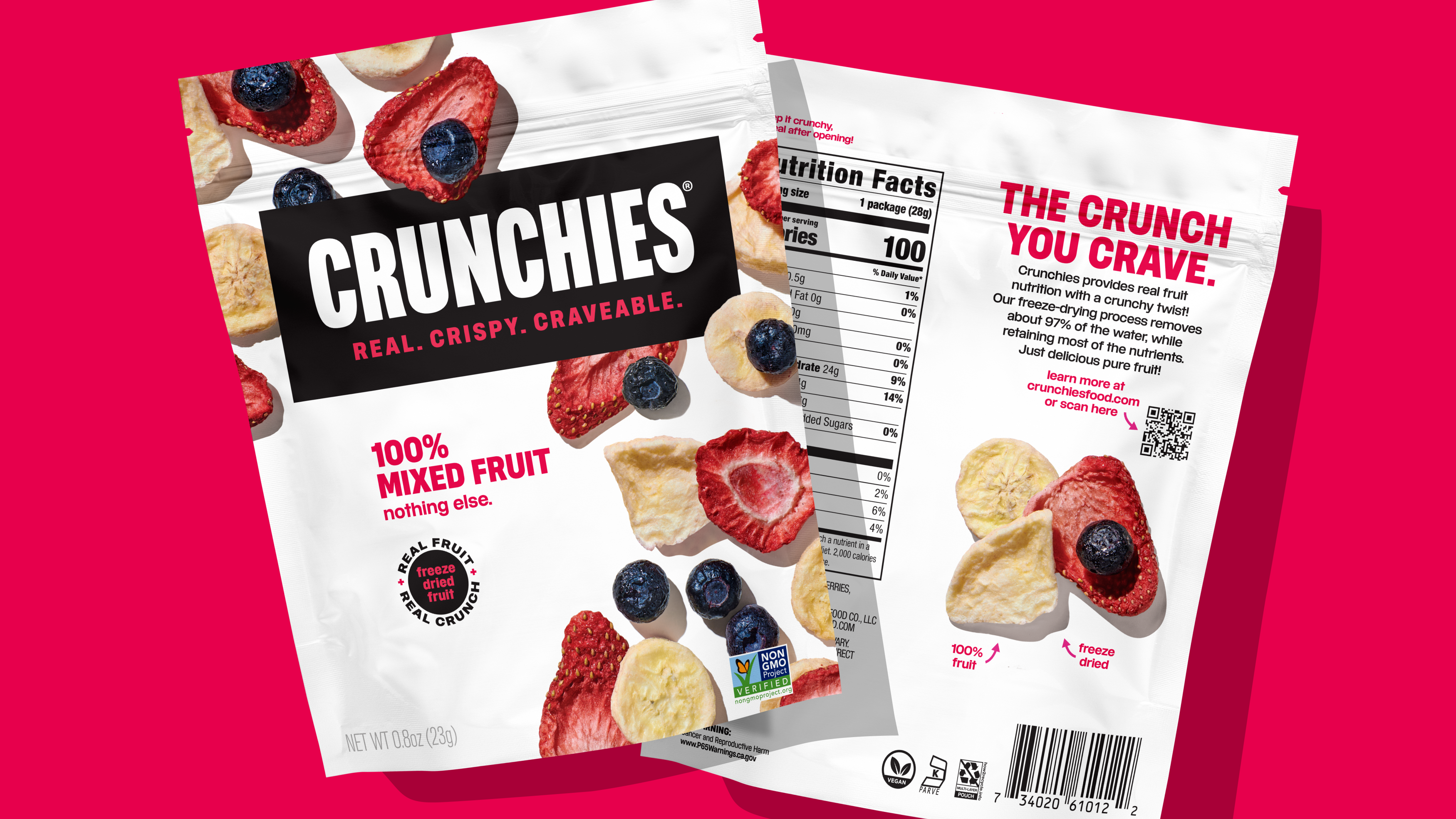
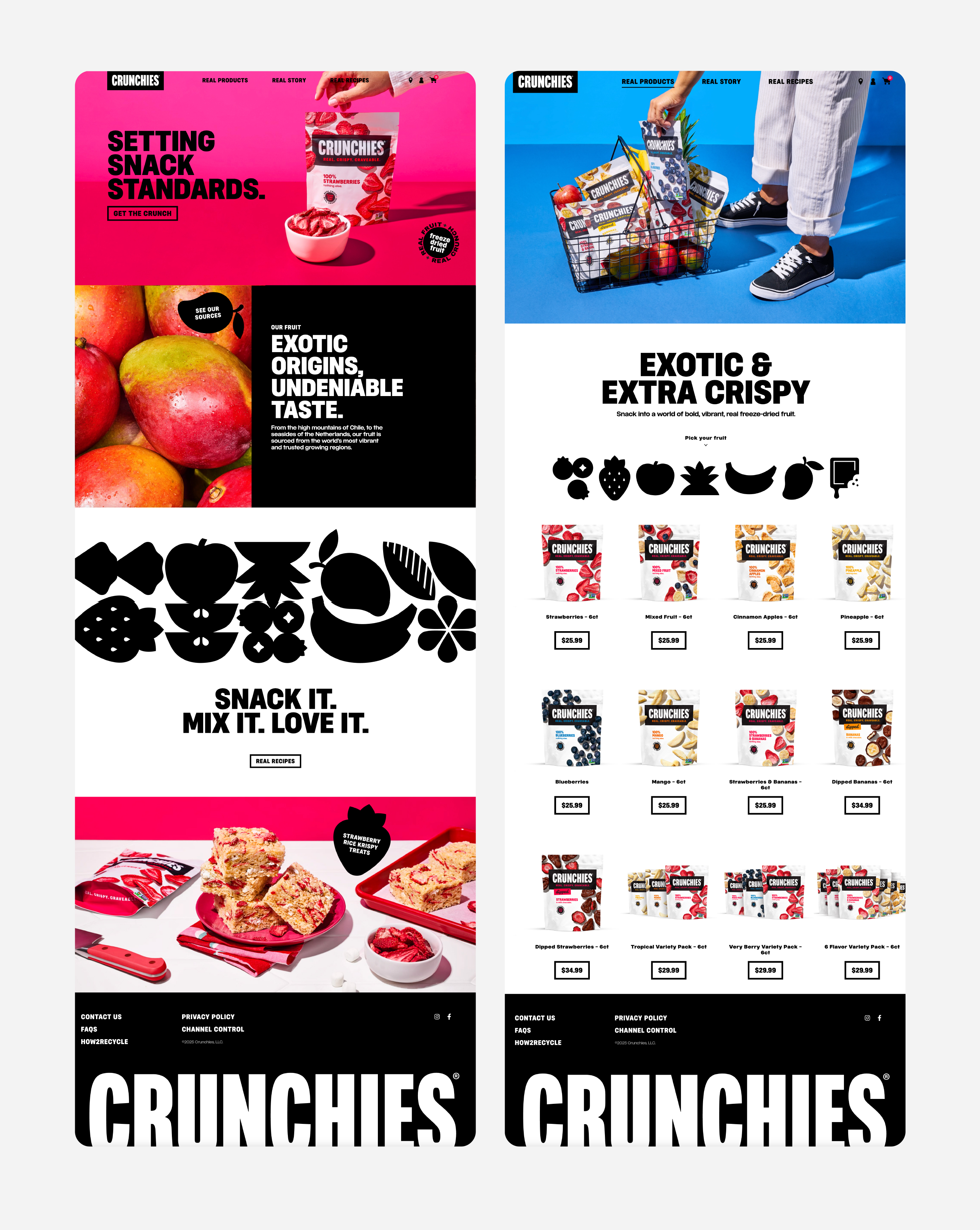
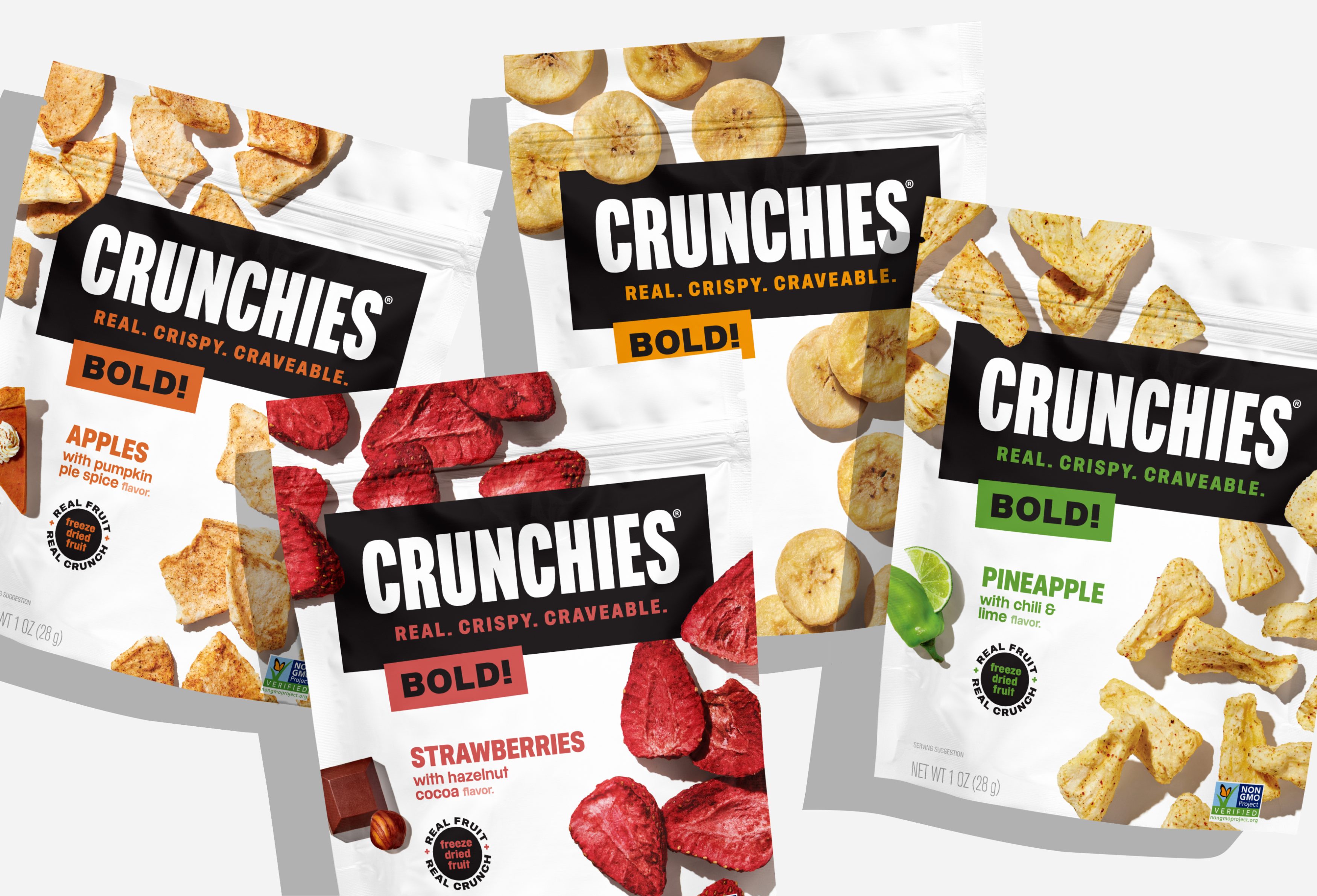
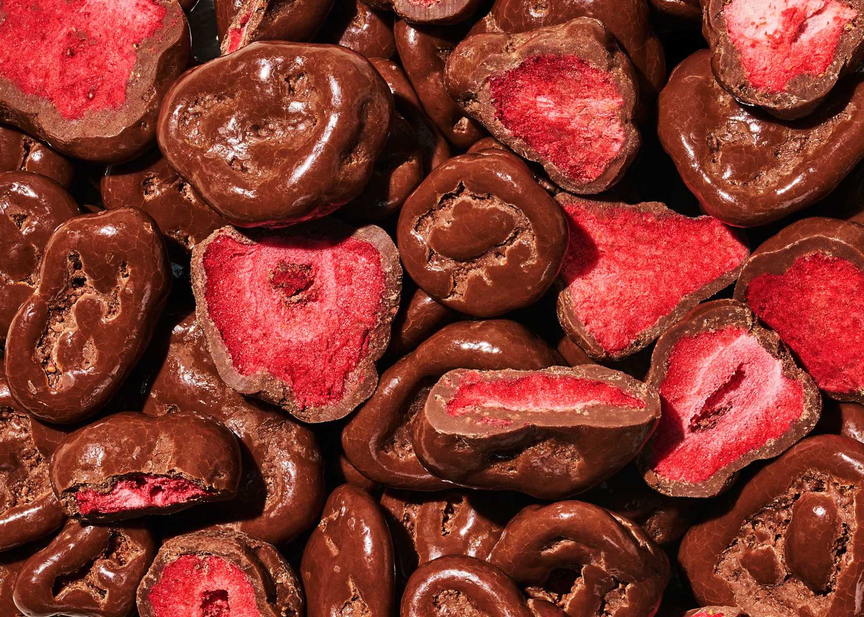
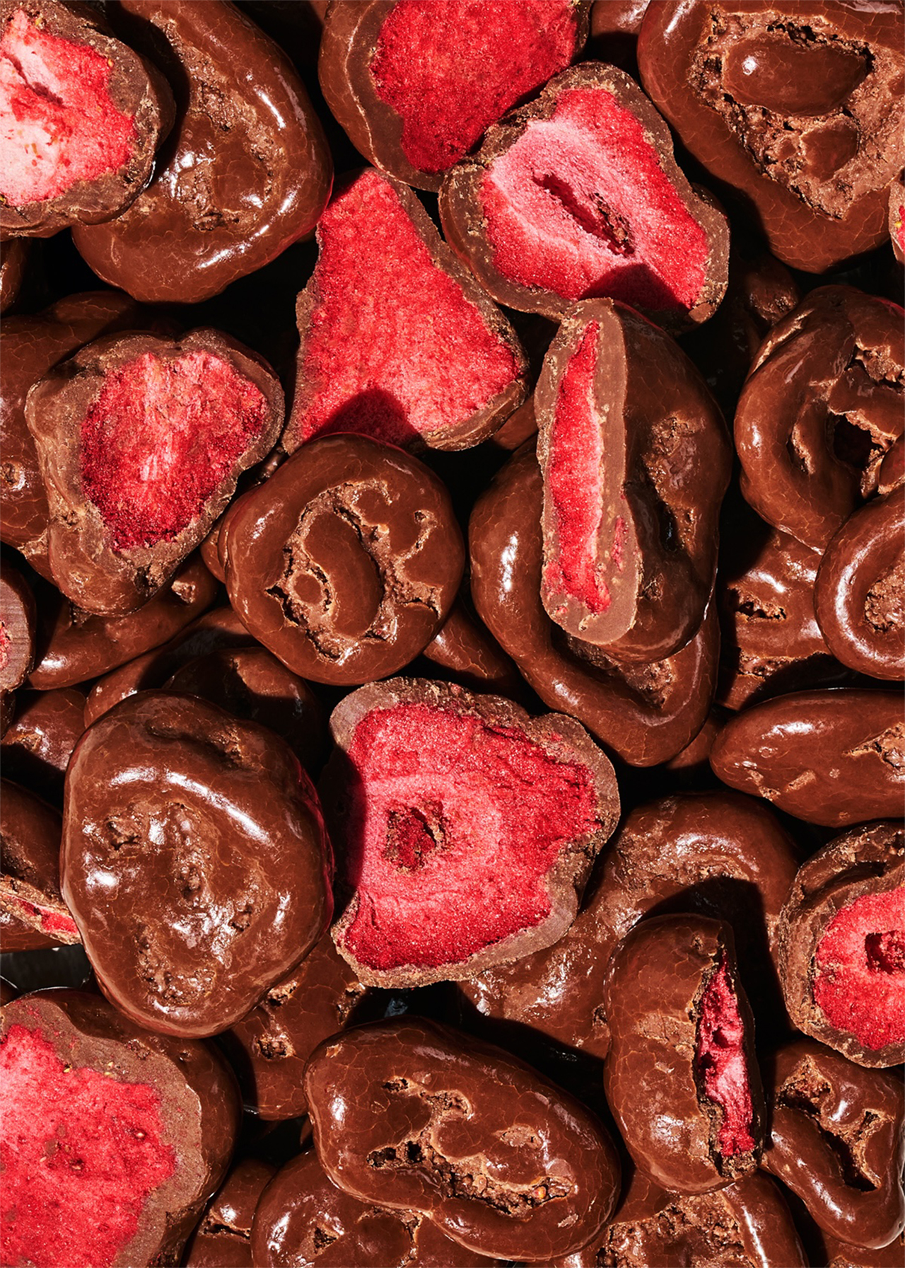
From the high mountains of Chile, to the seasides of the Netherlands, Crunchies sources fruit from the world’s most vibrant and trusted growing regions. Freeze-dried to lock in nutrients and preserve the best of nature, each bite delivers a crunchy twist that hits just right. As a leader in clean, healthy snacking, Crunchies was looking to expand their portfolio and improve shelf impact and relevance. That’s where we came in.
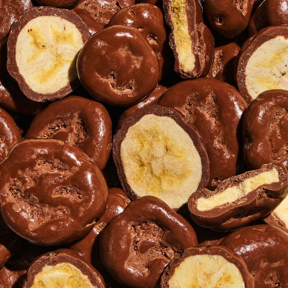
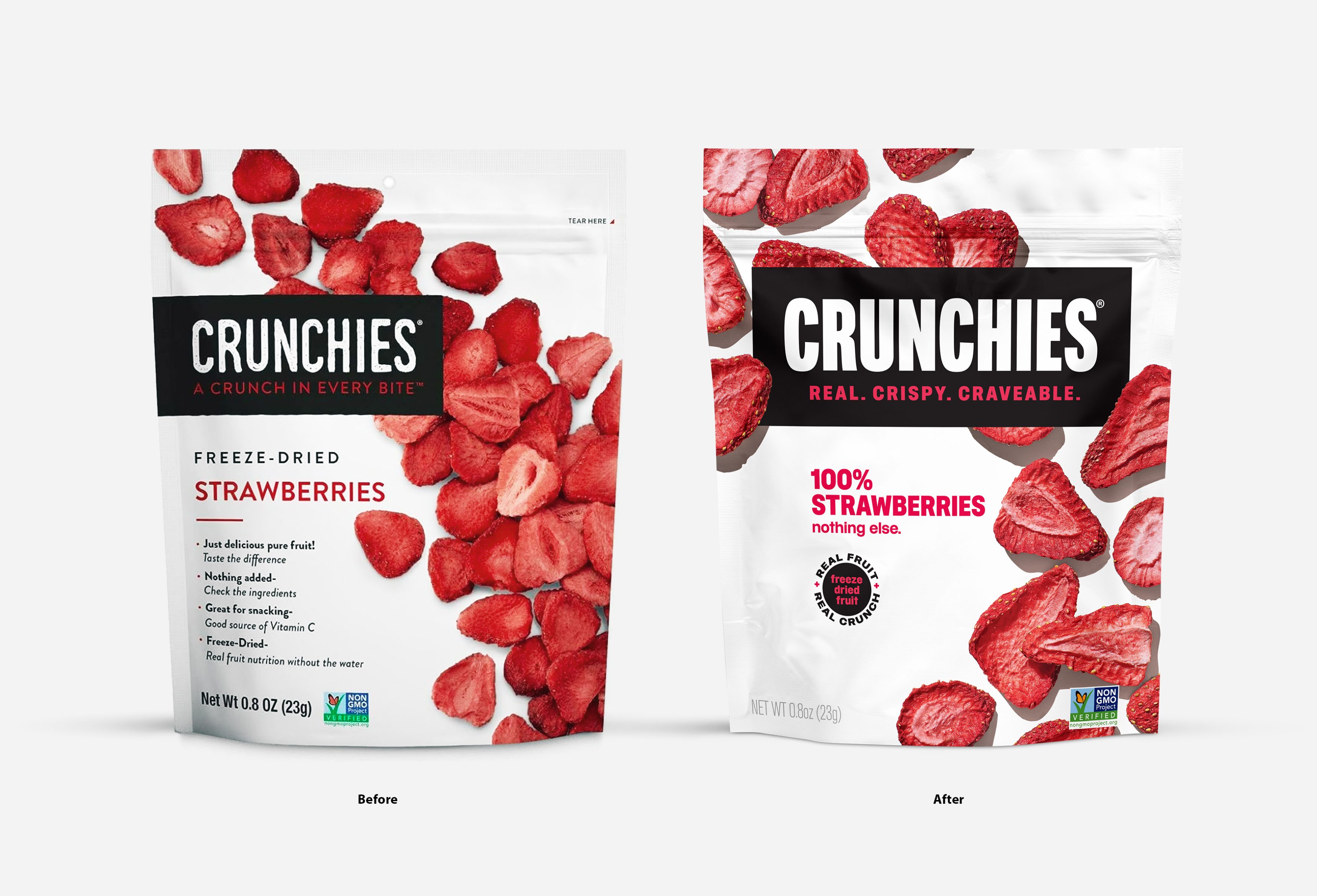
Prominently positioned “center pack”, the bold new brandmark anchors the refresh, creating undeniable shelf presence. Included in the new lockup, the mantra “Real. Crispy. Craveable.” succinctly sums up the brands USP. Clearly defined product segmentation and simplified on pack navigation make the new design system easier to navigate and shop. Rounding out the brand refresh, crave-worthy photography and new narrative shine both on pack and online within the newly launched website.