

Peelz.
Brand refresh.
CPG Brand Strategy. Visual Identity. Brand Narrative. Package Design. Website. Photography.
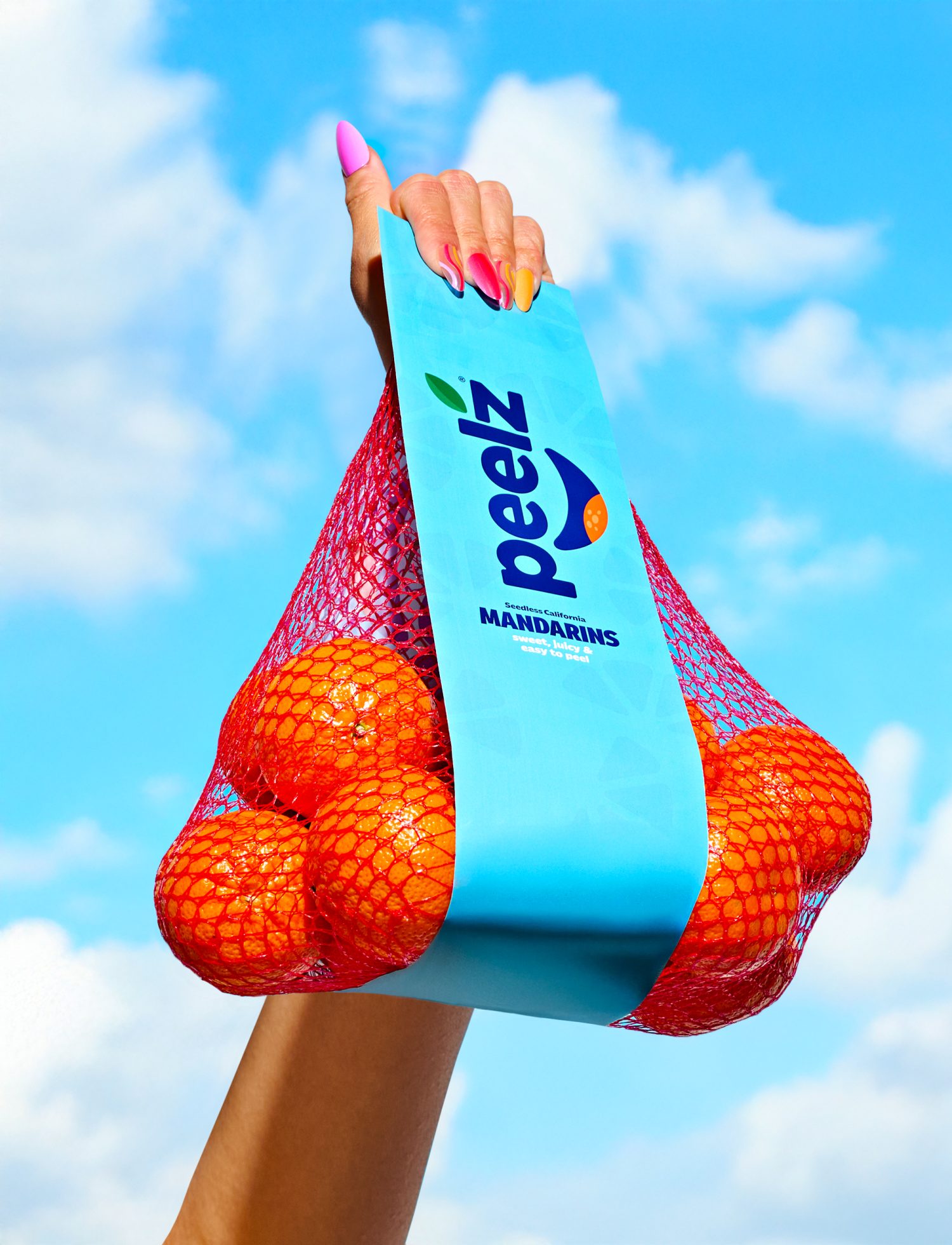
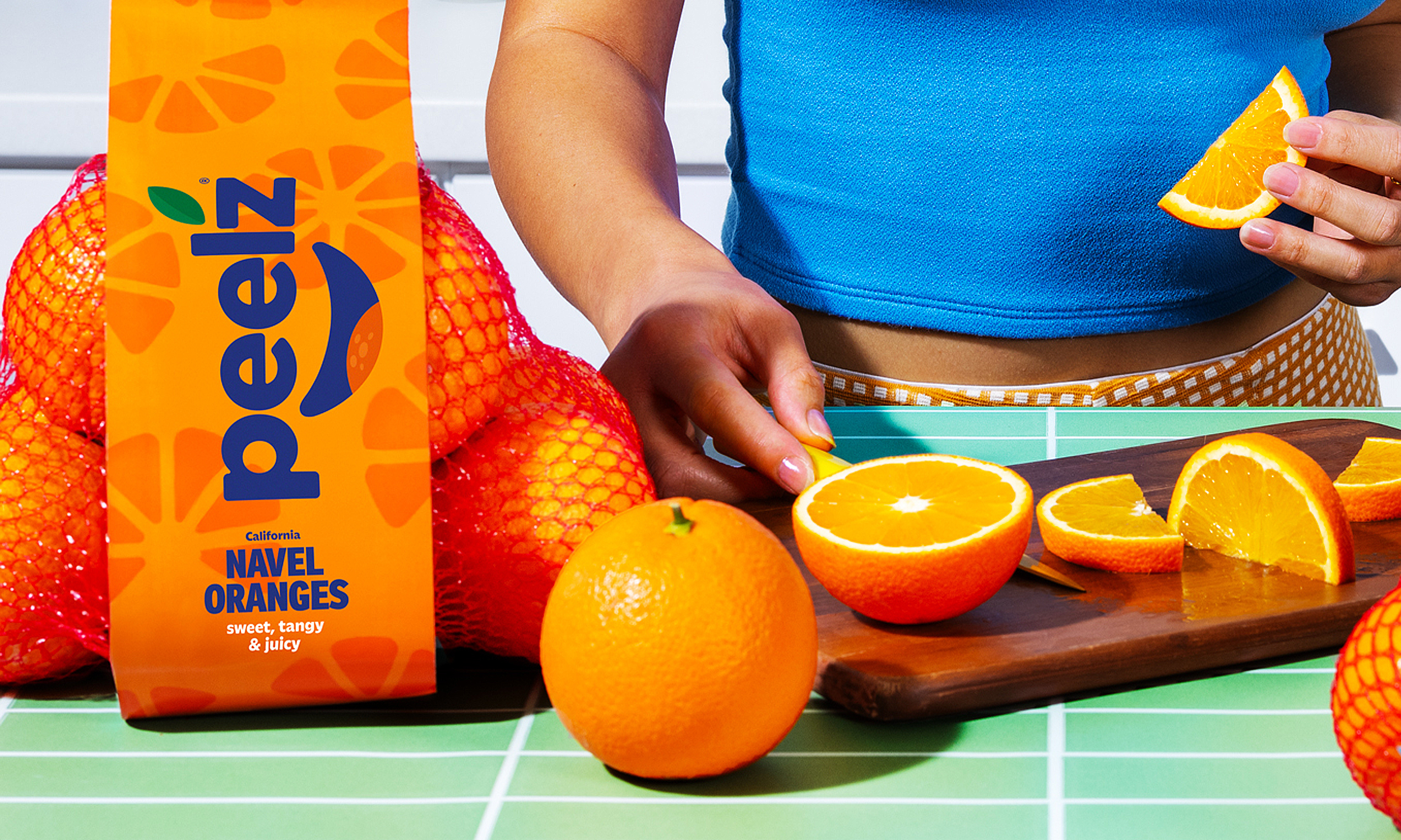
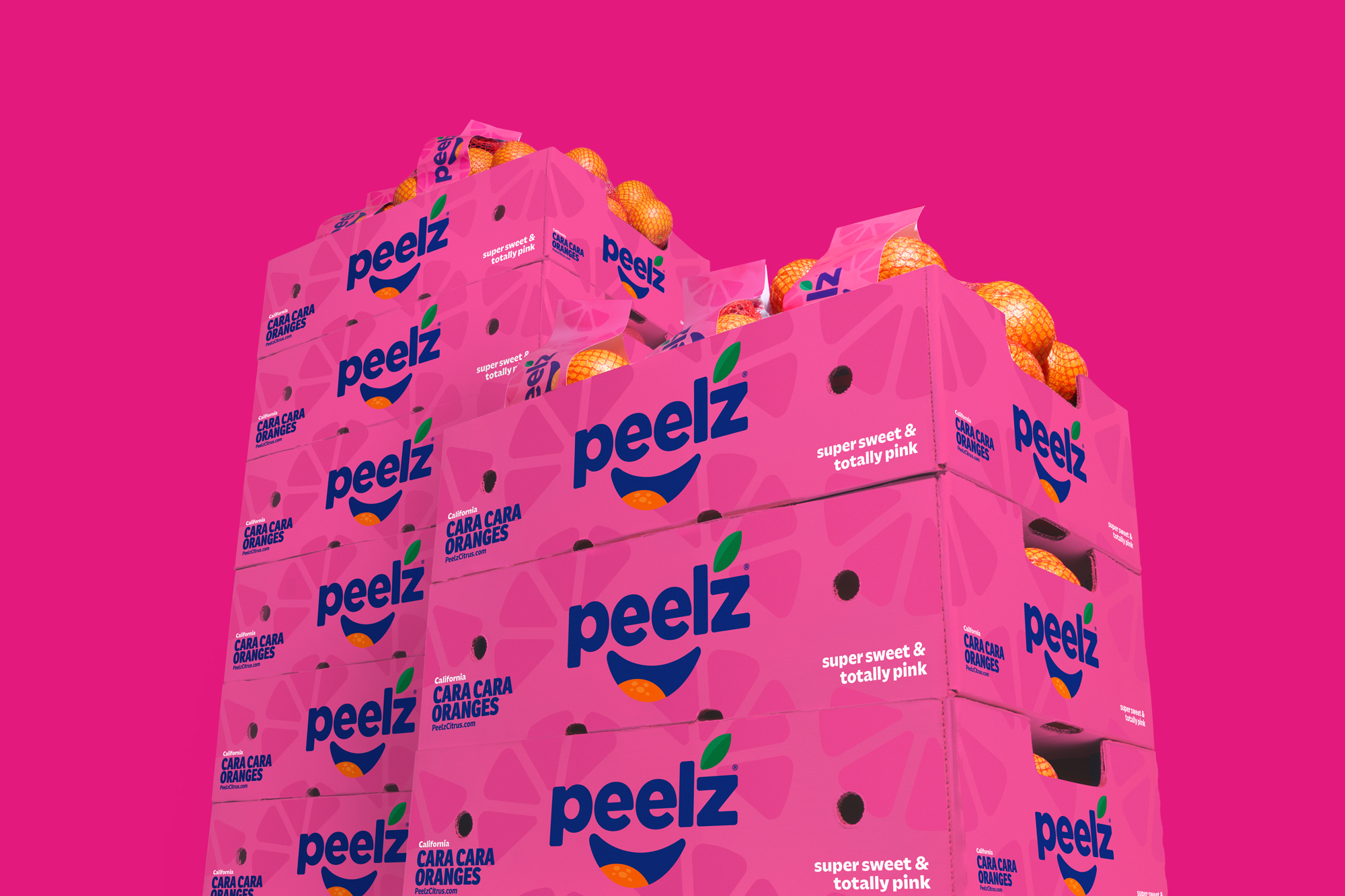
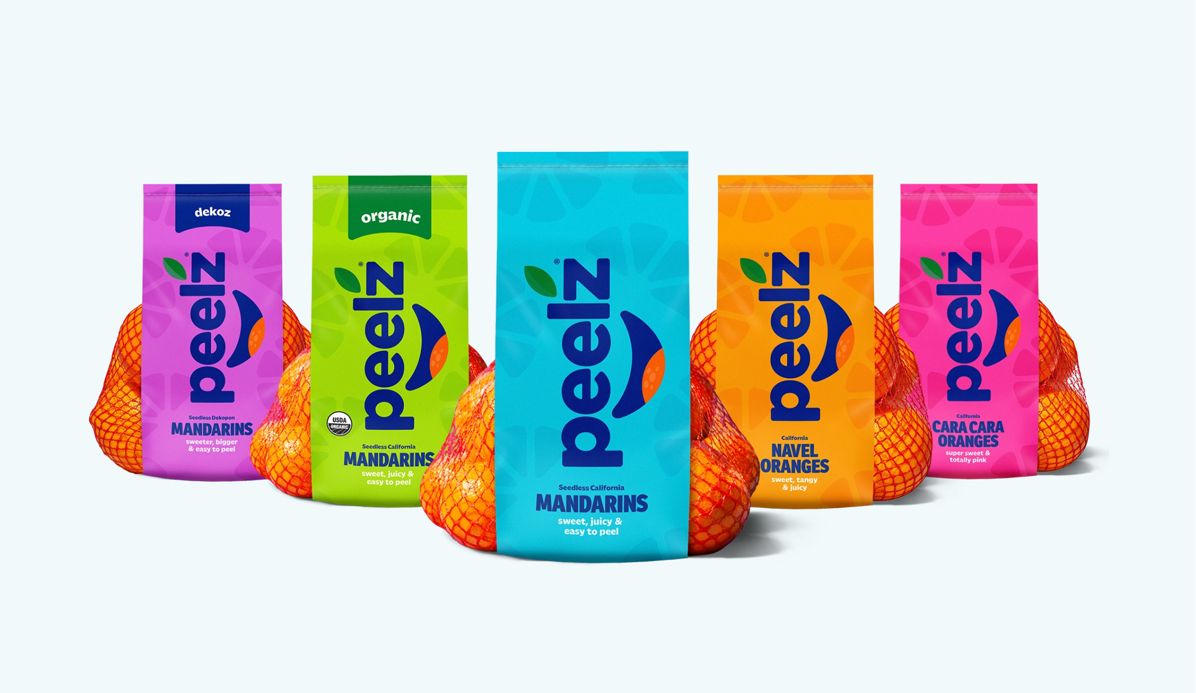
Best known for its mandarins, Peelz set out to build stronger notoriety and equity across its full citrus portfolio—shifting perception from a single standout commodity to a true category leader. In a space dominated by soft, cutesy cues, Peelz and its parent company, Fowler, bring an unapologetically bold, vibrant attitude. Our challenge was to express that confidence across packaging, website, and marketing—while remaining approachable, kid-friendly, and competitive in easy-peel mandarins, with healthful snacking benefits clearly communicated.
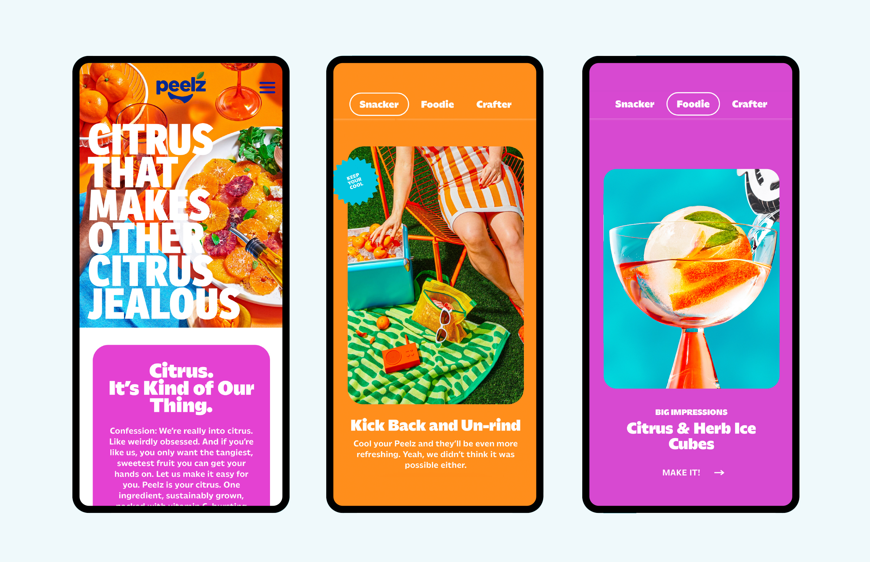
We brought the identity to prominence through an evolved packaging system, introducing a rainbow color strategy to segment the portfolio and cue flavor. The brand’s dotted gradient was modernized into a citrus slice–inspired pattern, improving production efficiency and consistency across substrates. The system extended into a redesigned website and marketing assets, supported by bold, in-house photography that delivers vibrant, juicy appeal with a modern edge. The result is a cohesive, ownable brand that strengthens shelf impact, elevates digital presence, and positions Peelz as a confident authority across the citrus aisle.