Swoop.
Brand creation.
CPG Brand Strategy. Naming. Design System. Visual Identity. Brand Narrative. Package Design. Photography.
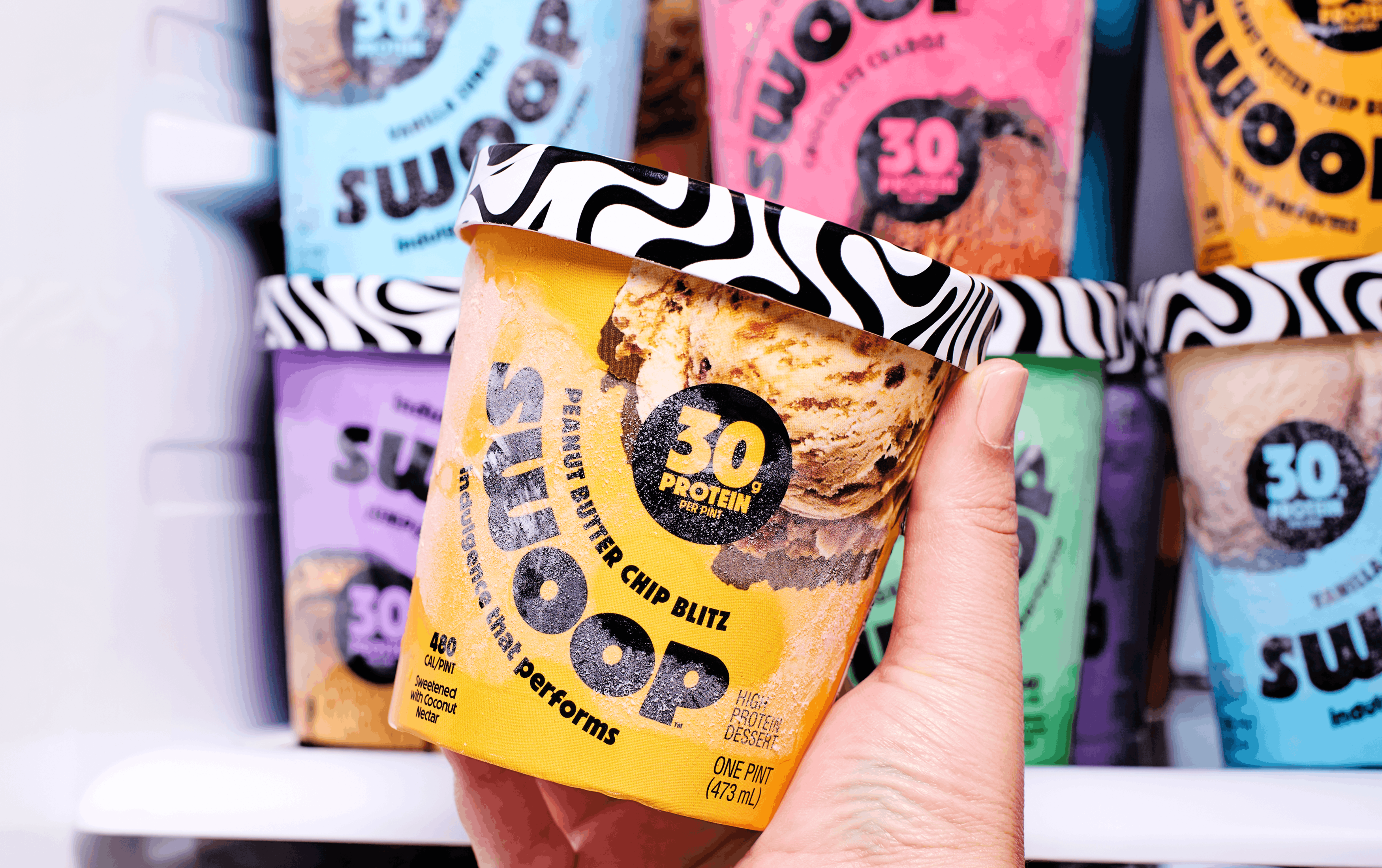
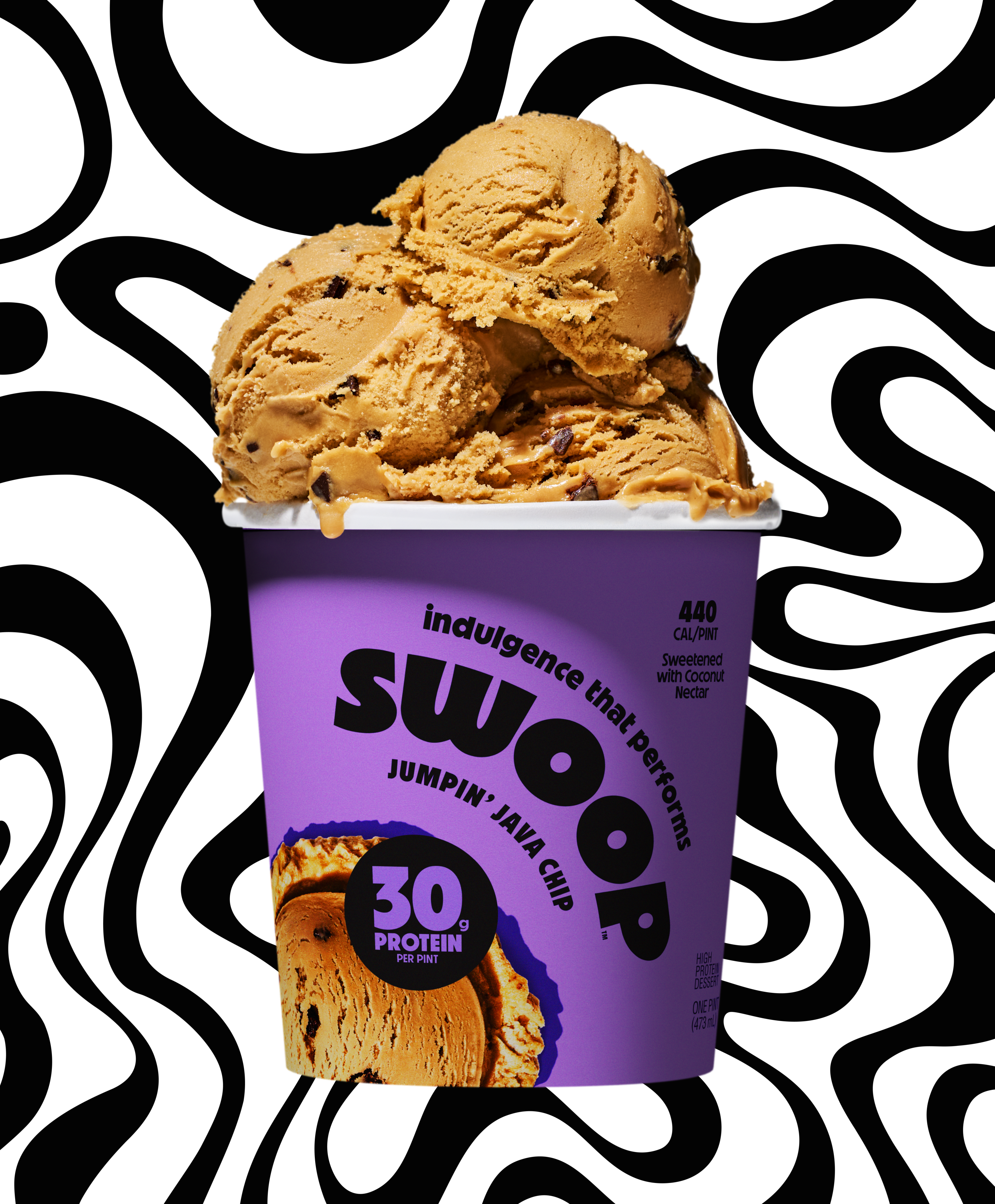
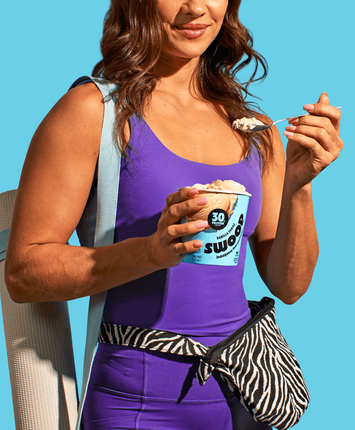
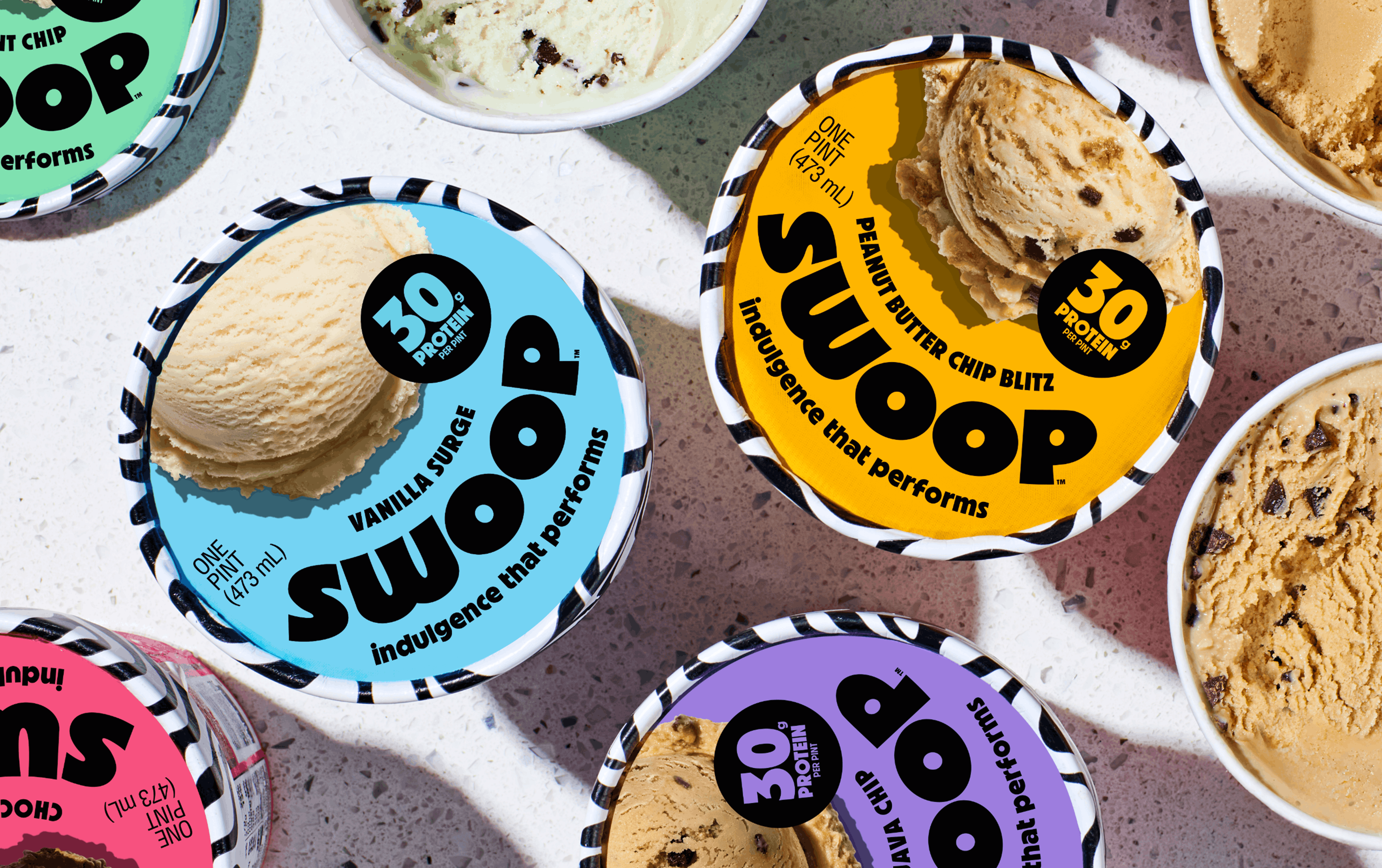
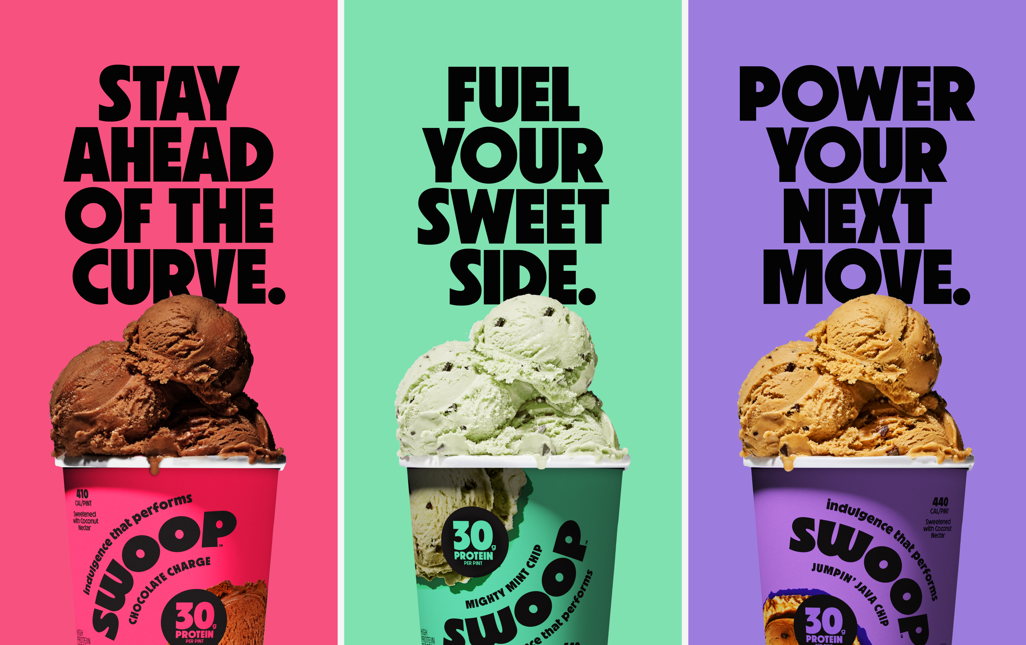
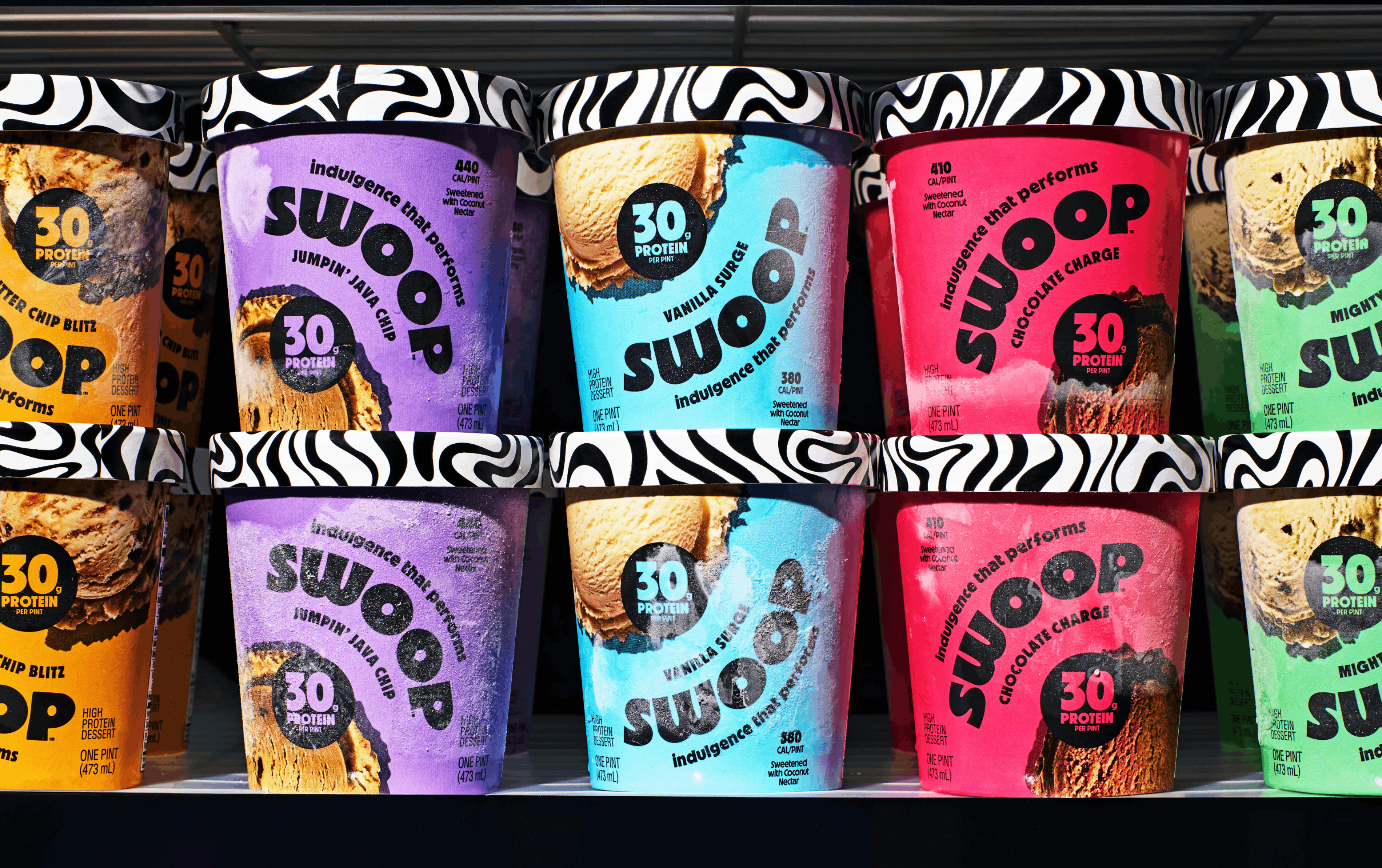
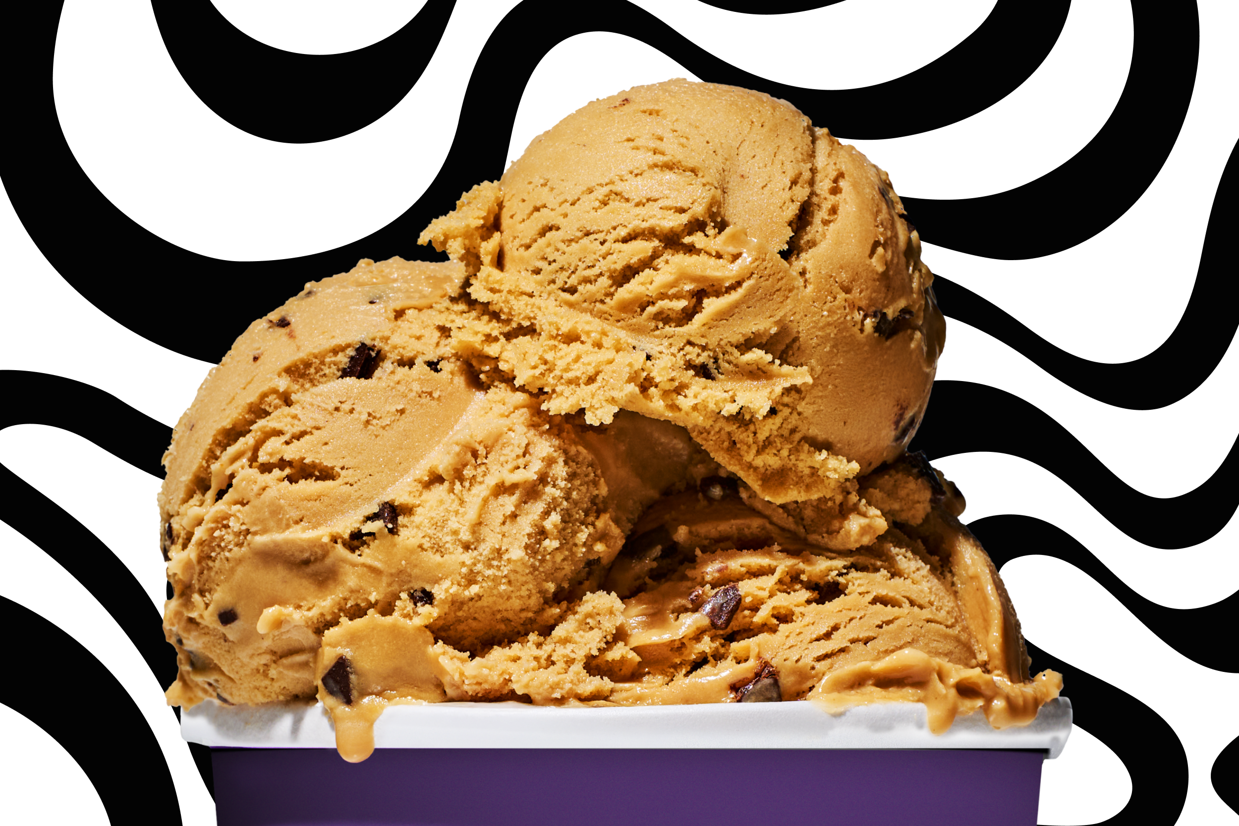
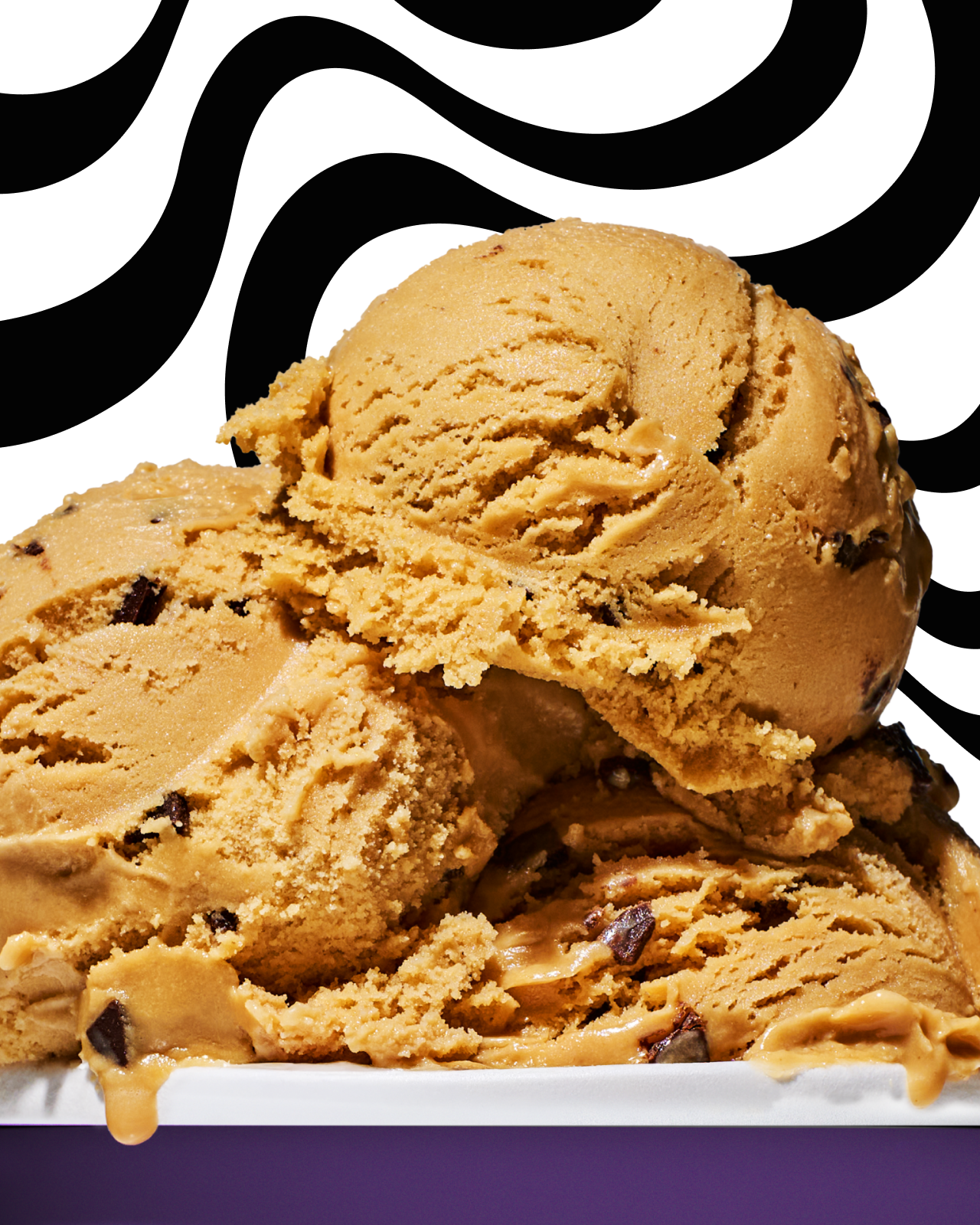
In a category crowded with low-calorie claims, artificial sweeteners, and chalky compromises, Swoop set out to redefine what better-for-you ice cream could be. With 30g of complete protein per pint and nothing artificial — ever — the ambition wasn’t to play into diet culture or deprivation, but to create a product where indulgence and performance work in tandem. The brand needed to feel elevated and craveable while still clearly delivering on its functional promise — a true sweet spot between lifestyle and utility.
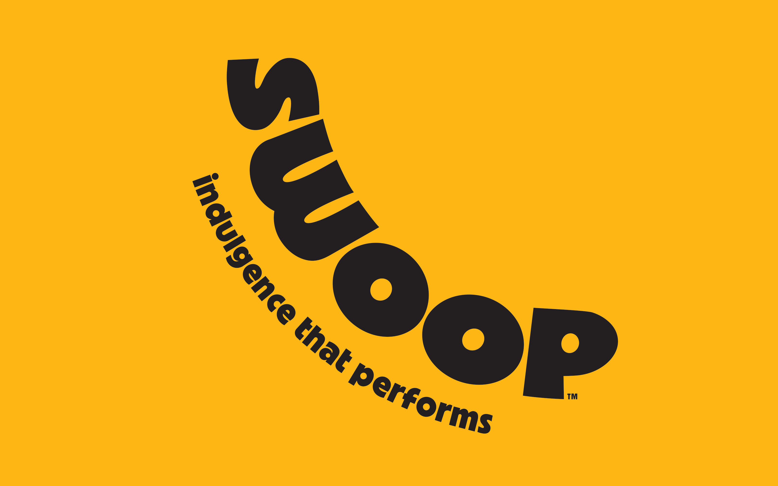
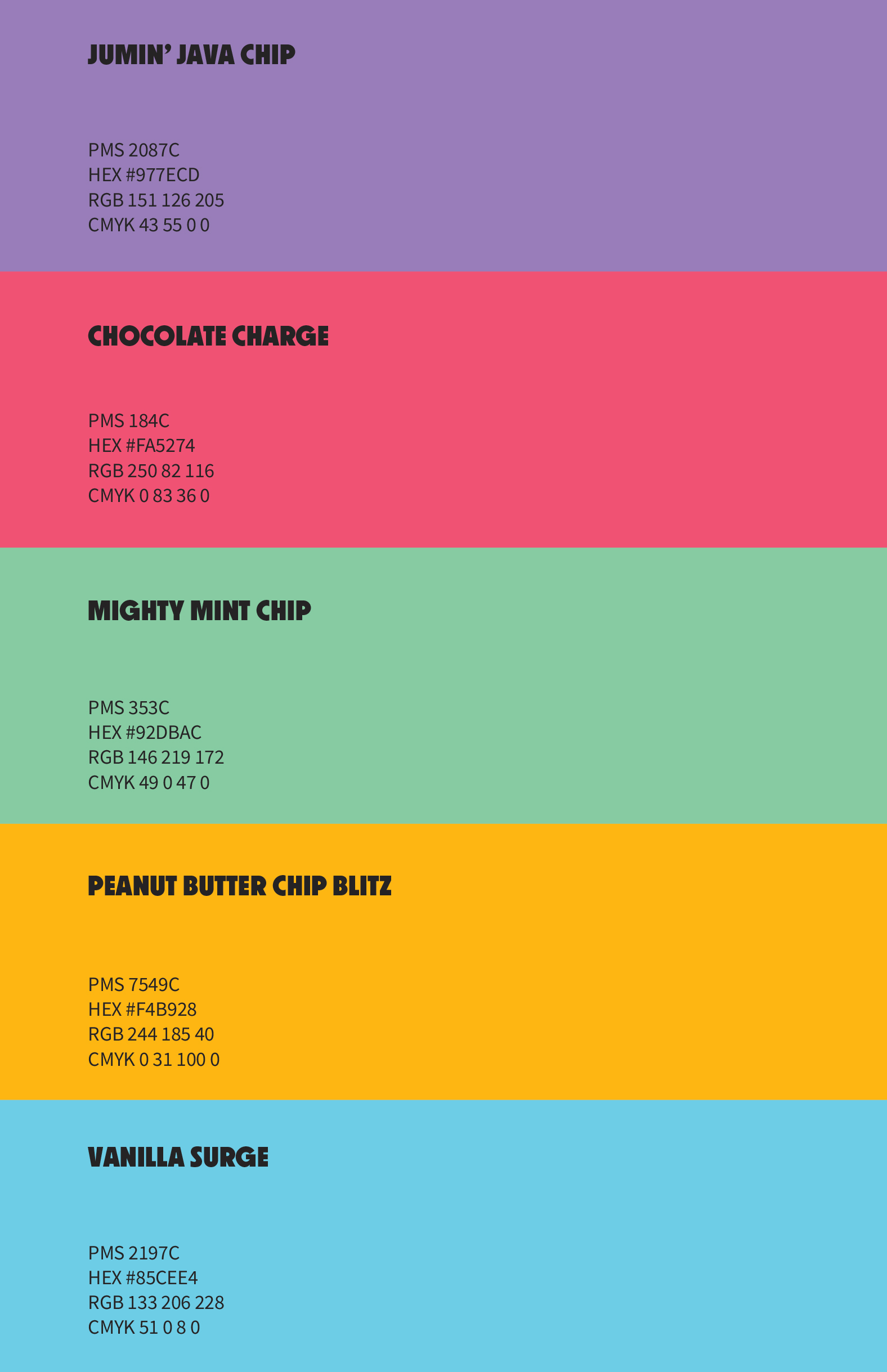
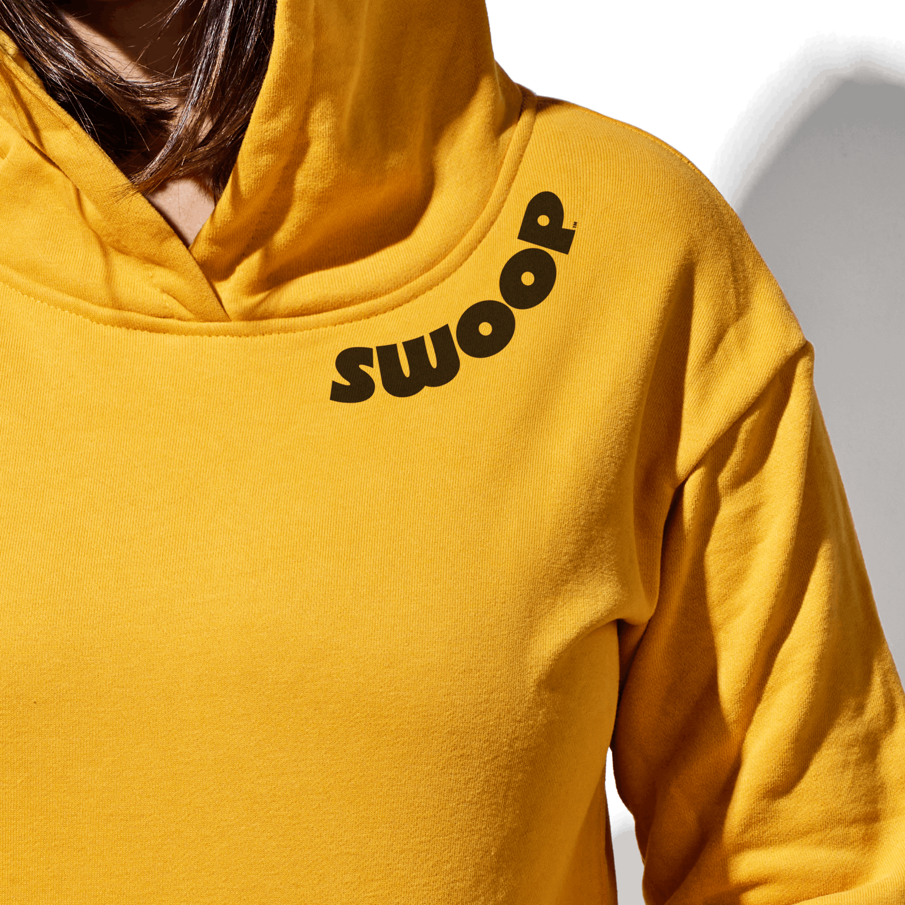
We partnered with the team to name the brand and build the strategy from the ground up, landing on Swoop — a name that suggests movement, momentum, and a decisive shift forward. Anchored by the positioning “Indulgence That Performs,” we crafted a voice that feels confident and ahead of the curve, avoiding both nostalgic dessert cues and aggressive gym aesthetics. Visually, the system balances strength and sensuality through high-contrast, texture-forward photography, a refined variable wordmark, and seamlessly integrated ingredient callouts. The result is a cohesive brand world where flavor, function, and feeling carry equal weight.