TruNut.
Brand refresh.
CPG Brand Strategy. Visual Identity. Package Design. Brand Narrative. Food Photography.
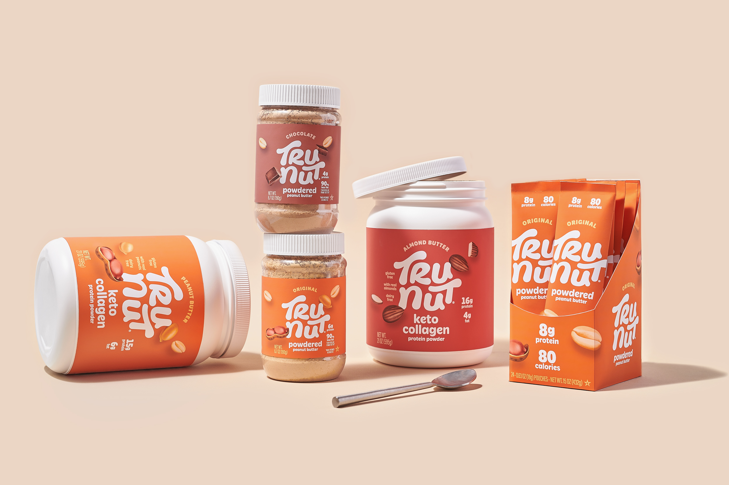
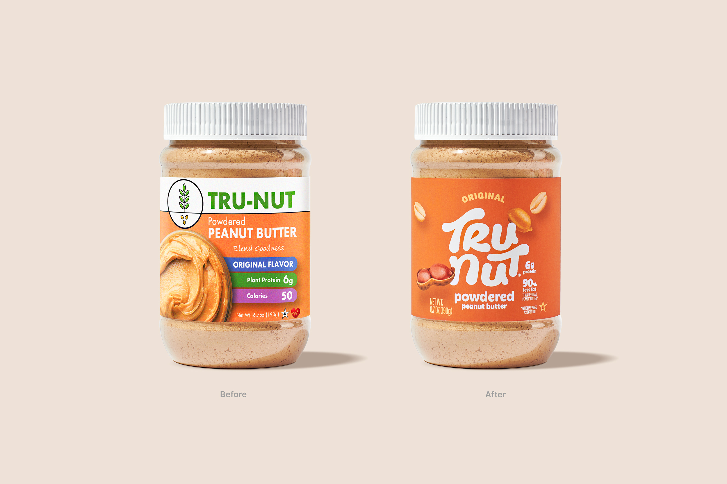
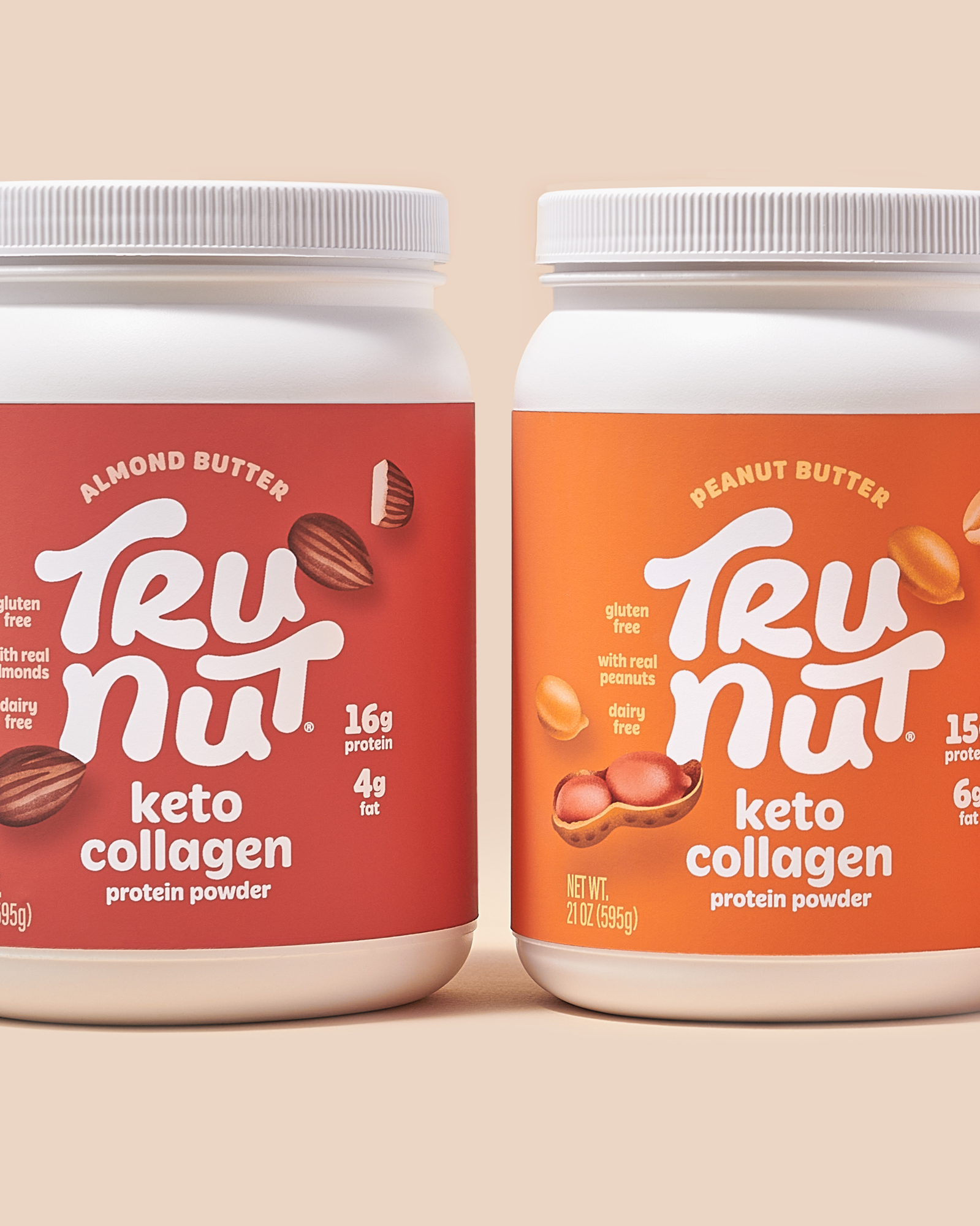
As a challenger brand in the powdered peanut butter category, TruNut has built a solid reputation for offering the best tasting option on the market. But like most brands in the category, its positioning felt more functional and sporty. This presented a clear opportunity to create new relevance and gain market share by refreshing the brand to better communicate its distinct difference–taste.
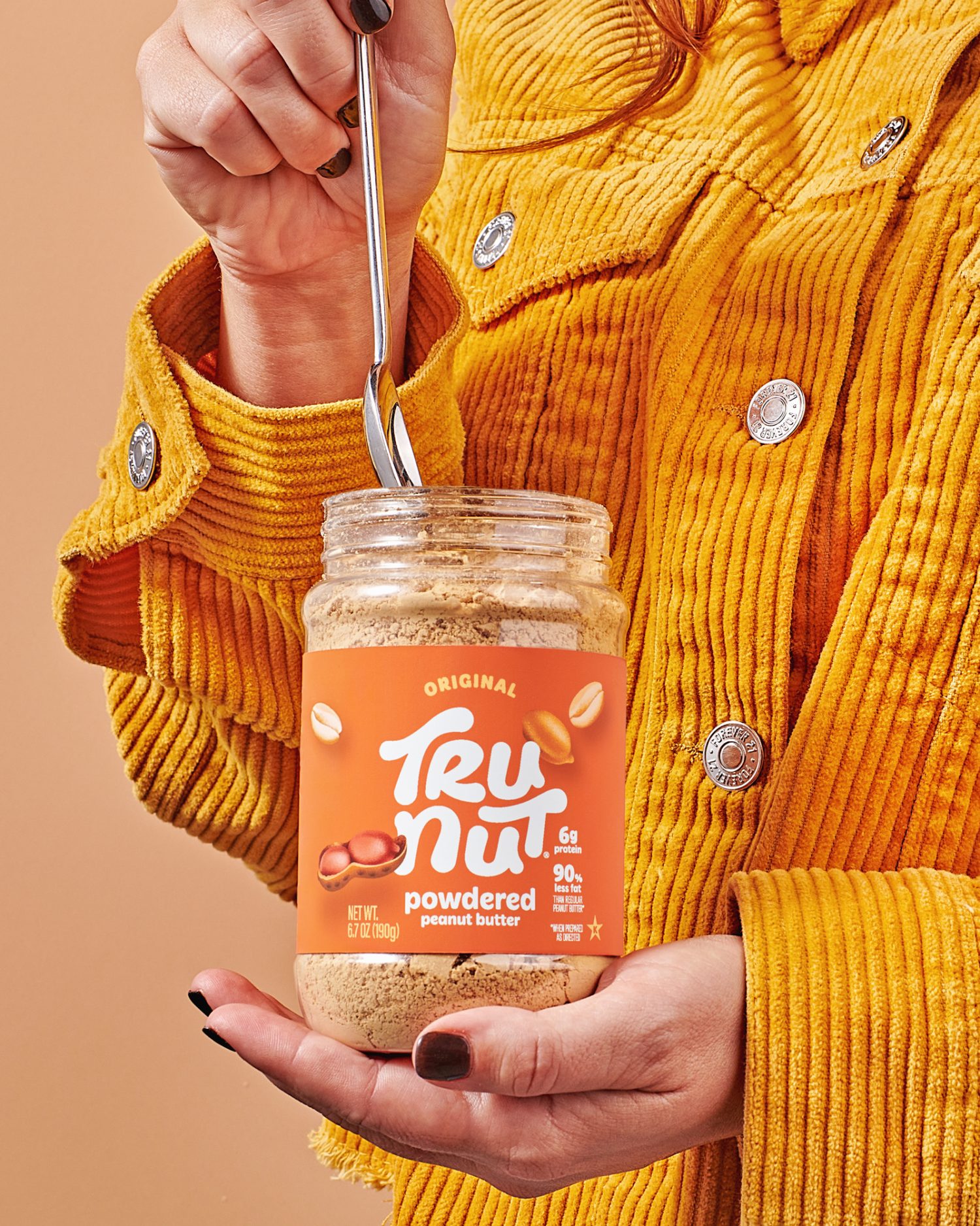
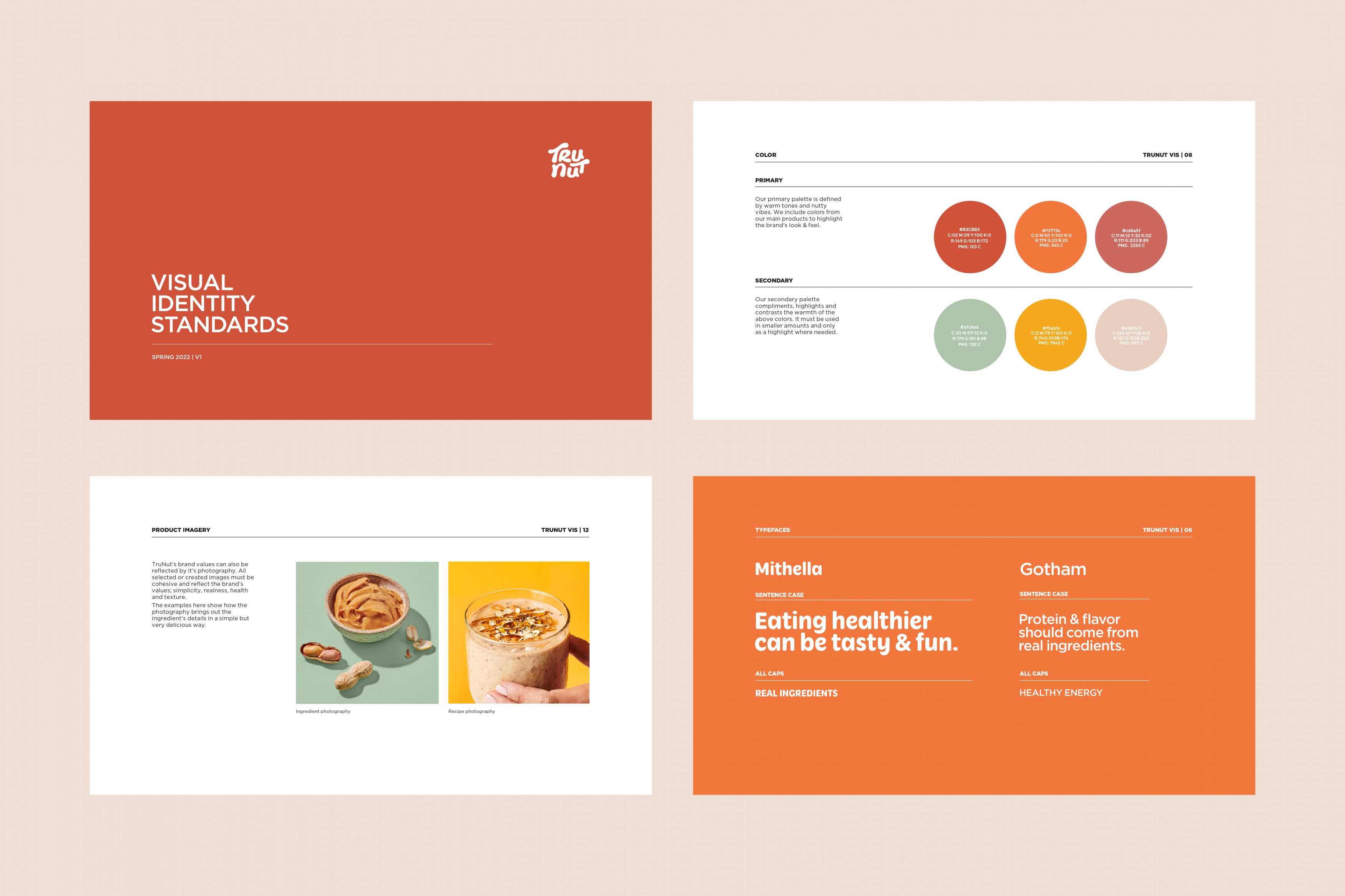
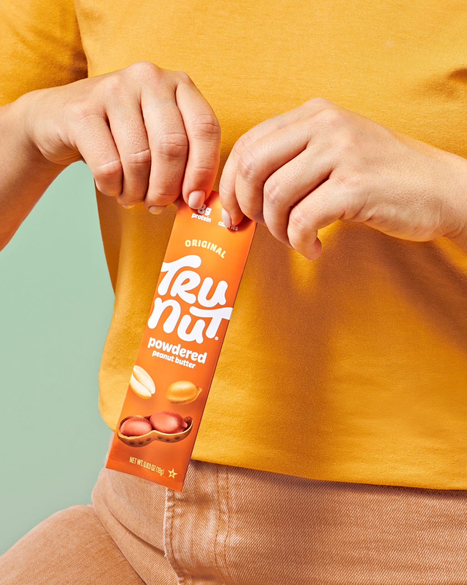
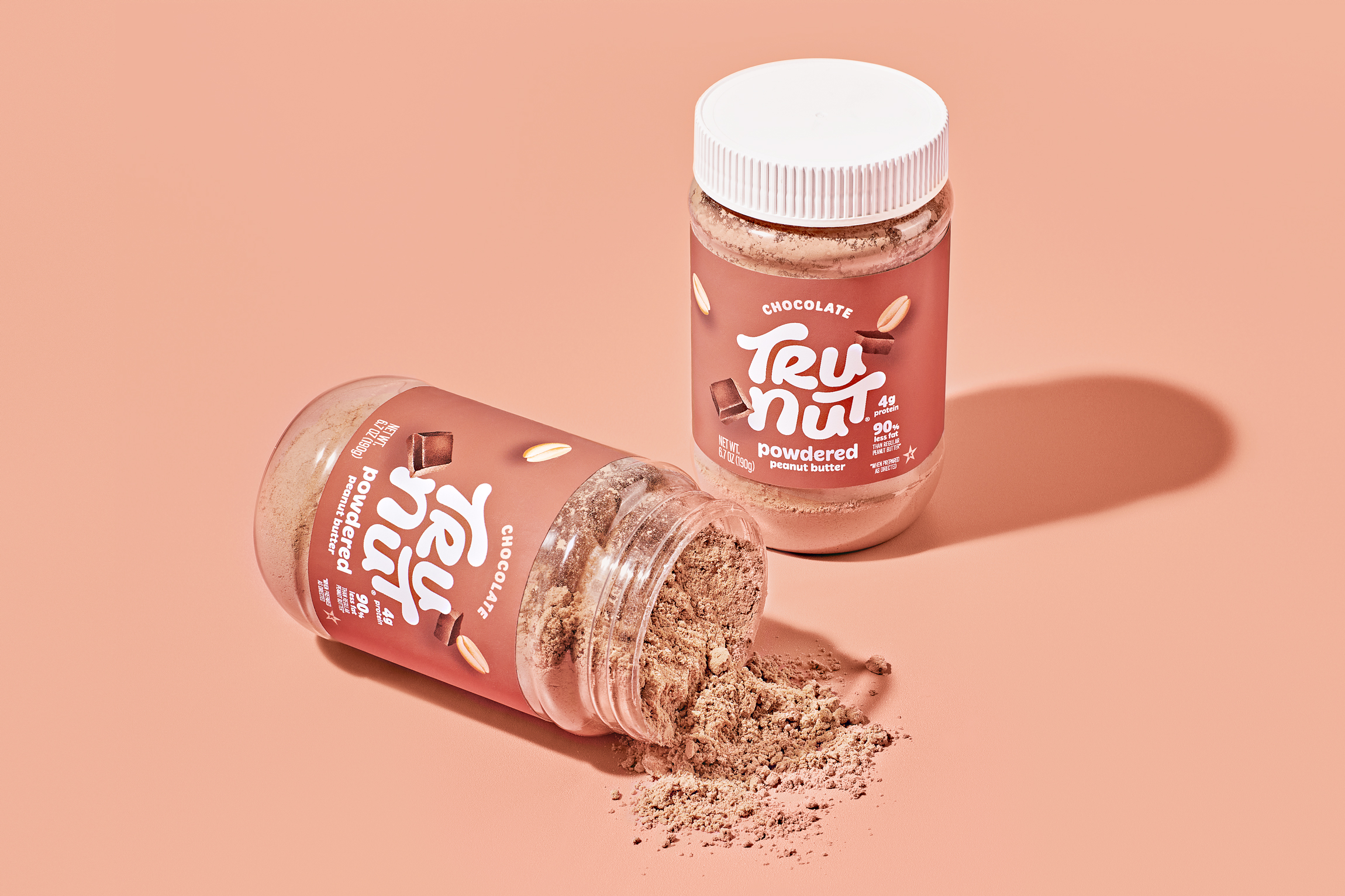
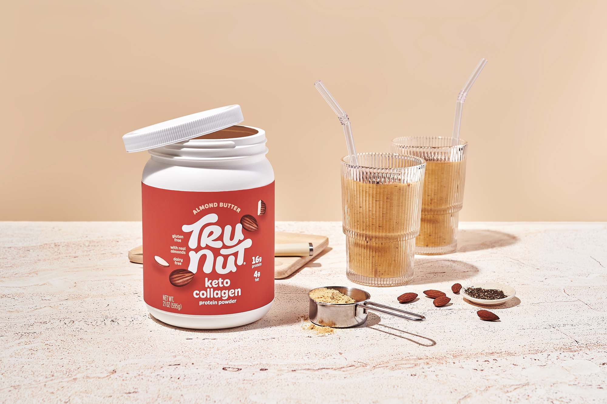
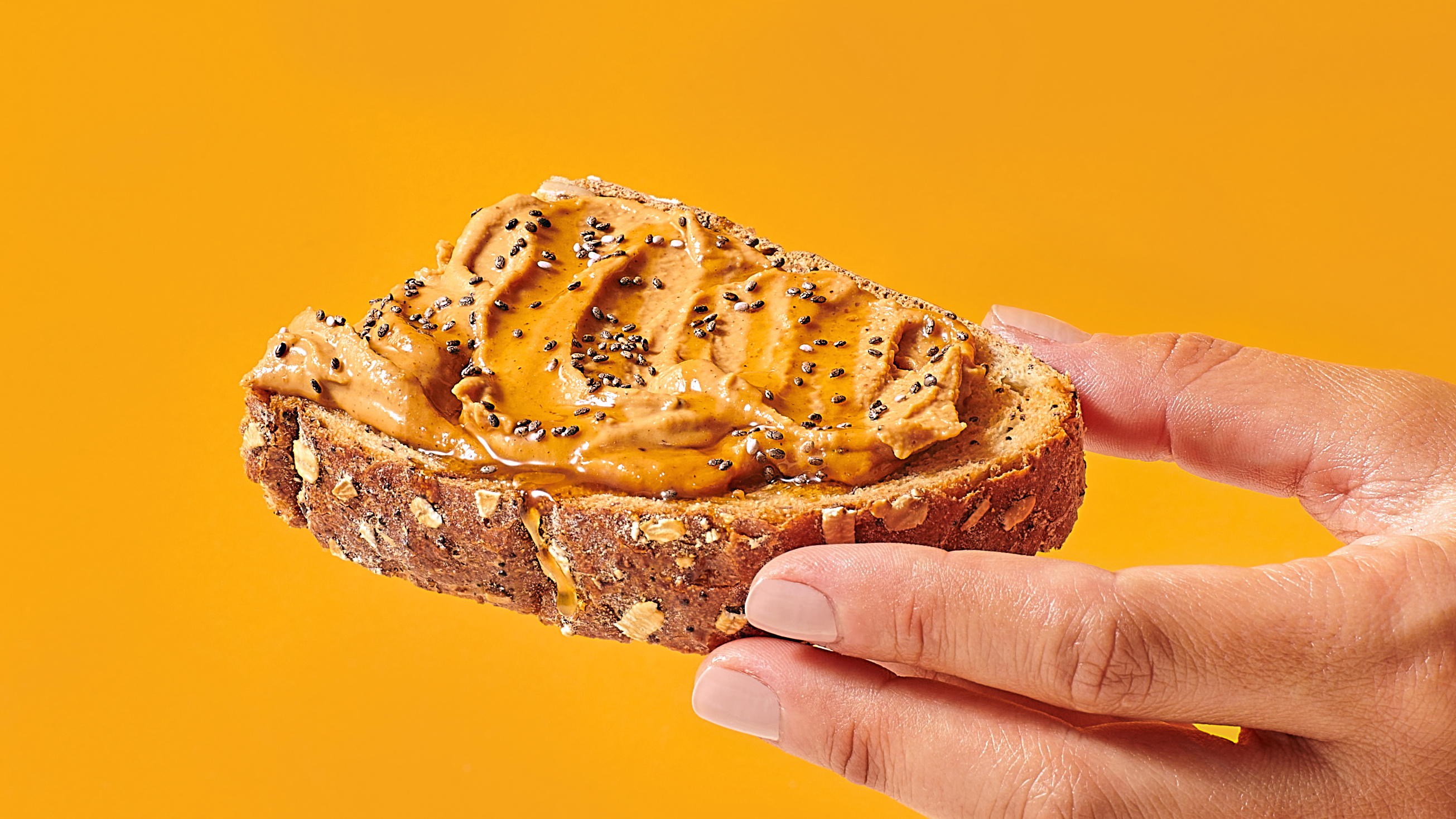
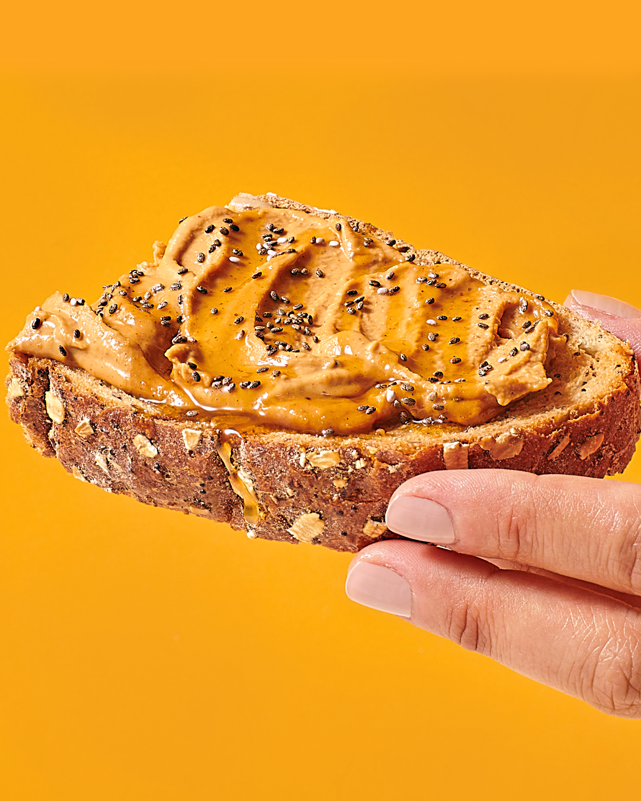
With an expressive, free flowing vibe, the new hand-lettered brandmark exudes the creamy, craveable texture of real peanut butter. Prominently placed, it speaks with flavor authority and creates true distinction for the brand at shelf. Vibrant color floods and photo realistic illustrations add taste appeal, rounding out the strategic design for a functional food brand that looks truly delicious.
